W11 Construction,with an enviable reputation, approached ikon to create a new brand identity for their luxury construction company and design a bespoke website to showcase their incredible properties.
W11 have developed some of the most exclusive residences in West London with record breaking resale values per square foot. With such a focus on professionalism and craftsmanship in their service, they were looking for a branding agency to match.
This was an opportunity to really make a mark on the luxury construction industry. What commonly happens within companies is they excel at what they are good and pay no attention to branding. With W11, there was no sense of ‘brand’ or a digital presence. The objective was to position W11 as a leader in the industry as well as create a beautiful website to demonstrate their ability and the scale of the projects they work on.
They did have the logo wordmark ‘W11’ to start with but everything was crafted around this. One of the biggest problems we saw immediately was the lack of quality project imagery and the fact that most of their properties were mid-construction. This meant our property branding agency needed to create a sense of luxury without the luxury visuals which is the opposite to most luxury projects we work on.
Usually they have the imagery and it’s the branding that lets it down. One of the first things we did was commission Dirk Lindner, a renowned architectural photographer to start shooting the 3 main properties we wanted to use as case studies for the website.
After our competitor analysis of other London based luxury construction companies, our luxury brand manager saw a very similar look and feel and if the imagery was beautiful, the copy was letting it down. We built a strong image of what not to do if W11 was to stand out which can be the opposite way people look to develop a website or brand. Thinking my competitor looks like this, so we must do something similar is totally the wrong approach.
The idea of branding is to utilise it to stand out, not blend in. The key elements of a successful identity, the typography, copy and imagery should be seen as opportunities to differentiate. We used all of these elements to separate W11 from the rest and it has a uniqueness no other competitor has.
As W11 build some of the most exclusive residences in London, you can imagine their attention to detail is set very high due to their clientele. This standard was evident when we were taken around the properties. The founder, Andy was passionate and proud of the meticulous attention of his supply chain, even to details of the leading on a roof which I am 99% sure the owners would never see. But that’s not the point, it was a man proud of his company and his work.
To capture the intricate detail that went into every property, our copywriter James spent hours with Andy and a tape recorder talking through the elements of each property that were features and what made that particular house so special. It was painstaking work to then filter these recordings and make sense of them to write beautifully detailed case studies on each.
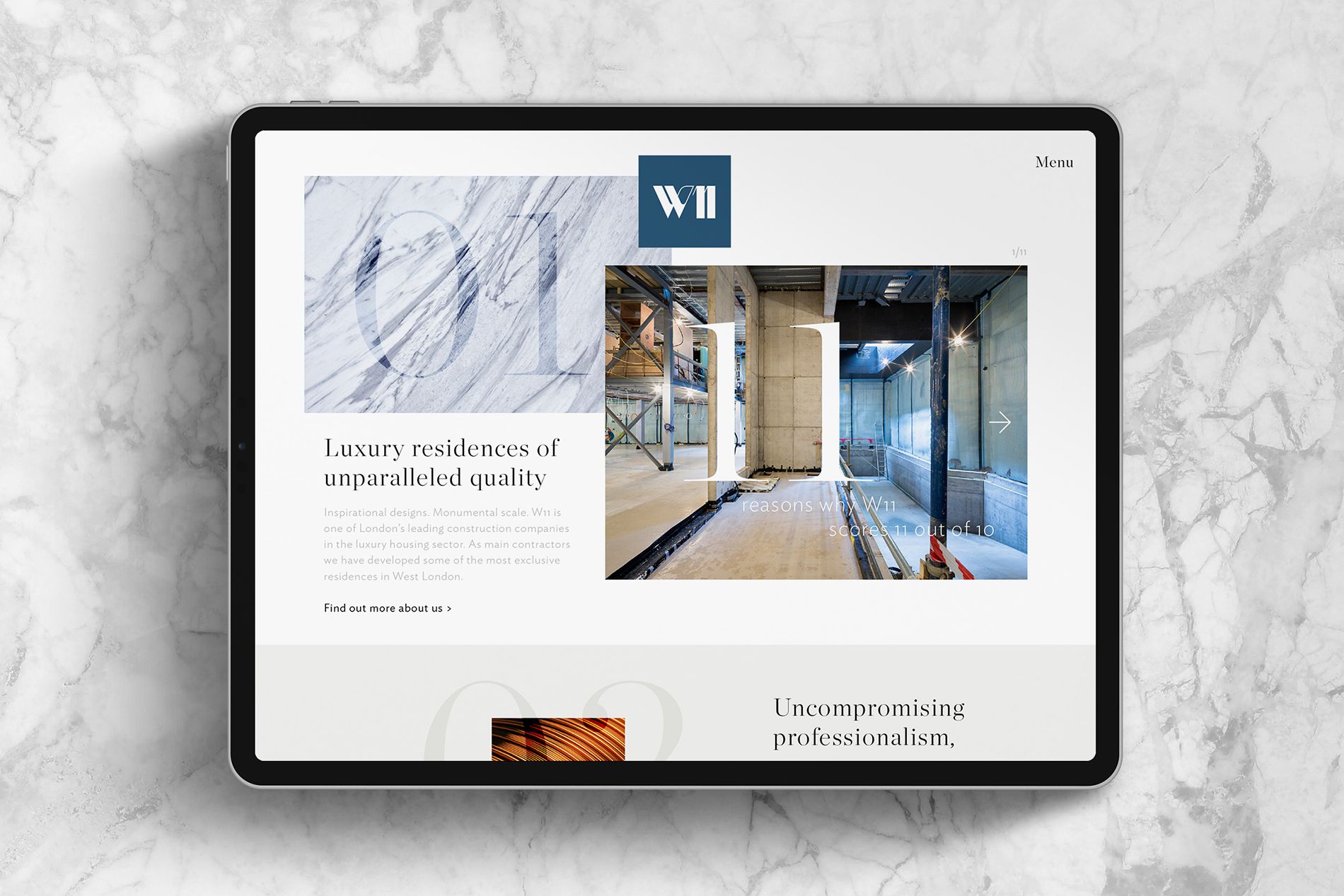
An often undervalued aspect of a brand identity is the type. I get it, people are not designers and sometimes it’s hard to see the intricacies of a font to see how they are different. Branding is all about how it makes people feel when they come into contact with a person or a business. Not only the words themselves but how the words are displayed can have a huge effect on a reading experience. Get the colour wrong, choose the wrong fonts or even choose a line width which makes it difficult for the brain to process can create users to hit the close button.
We wanted the type to feel luxury yet modern so we chose quite a classic font pairing but we wanted to take it one step further and integrate the type into the imagery to signpost sections of the site. With numerals in the company name, it made sense to make a feature of them.
As we introduced type into the imagery, another element we wanted to convey is the use of only the finest materials that are used throughout the build. That applies to the construction and then the finished interiors. Our agency for luxury brand identity developed a layered style of imagery that merged typography, materials and project photography to create visuals no other luxury construction company had imagined.
Considering W11 Construction are all about a bespoke design and build, it’s only fitting they came to us for the same to be applied to their website. The founders, Magda and Andy were very responsive to being led with the design rather than having pre-conceptions of how their website and branding should look.
It’s the way we work at ikon, we have faith in everyone that works with us as we choose experts and the same applies in this instance, I wouldn’t tell them how to design or build a house. This approach always produces the best results and that is evident when compared with their competition.
The site was designed and developed to be fully responsive across all devices. Our agency for website design even went one further to ensure we introduced specific styling to ensure when viewed even on an imac, it was pixel perfect.