With so much competition in the design and architecture space, it’s so important to use your website as a showcase to highlight your work but also to explain why you are different to everyone else. A common mistake is looking to what everyone else is doing and creating something similar that is on trend. I want to highlight some of the very best architecture websites and how you can apply the best branding for architects' principles used to improve your site.
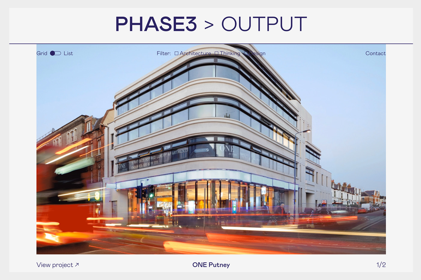
Phase 3 is one of the most unique architect’s websites we have seen. It breaks a lot of the typical web design rules but it pulls it off well. The great use of typography again is distinct enough to be different but not too far away from the norm. They have created a really nice mixed feed of work with news and their writing. They can definitely own what they say “Be Different to Make Different.”
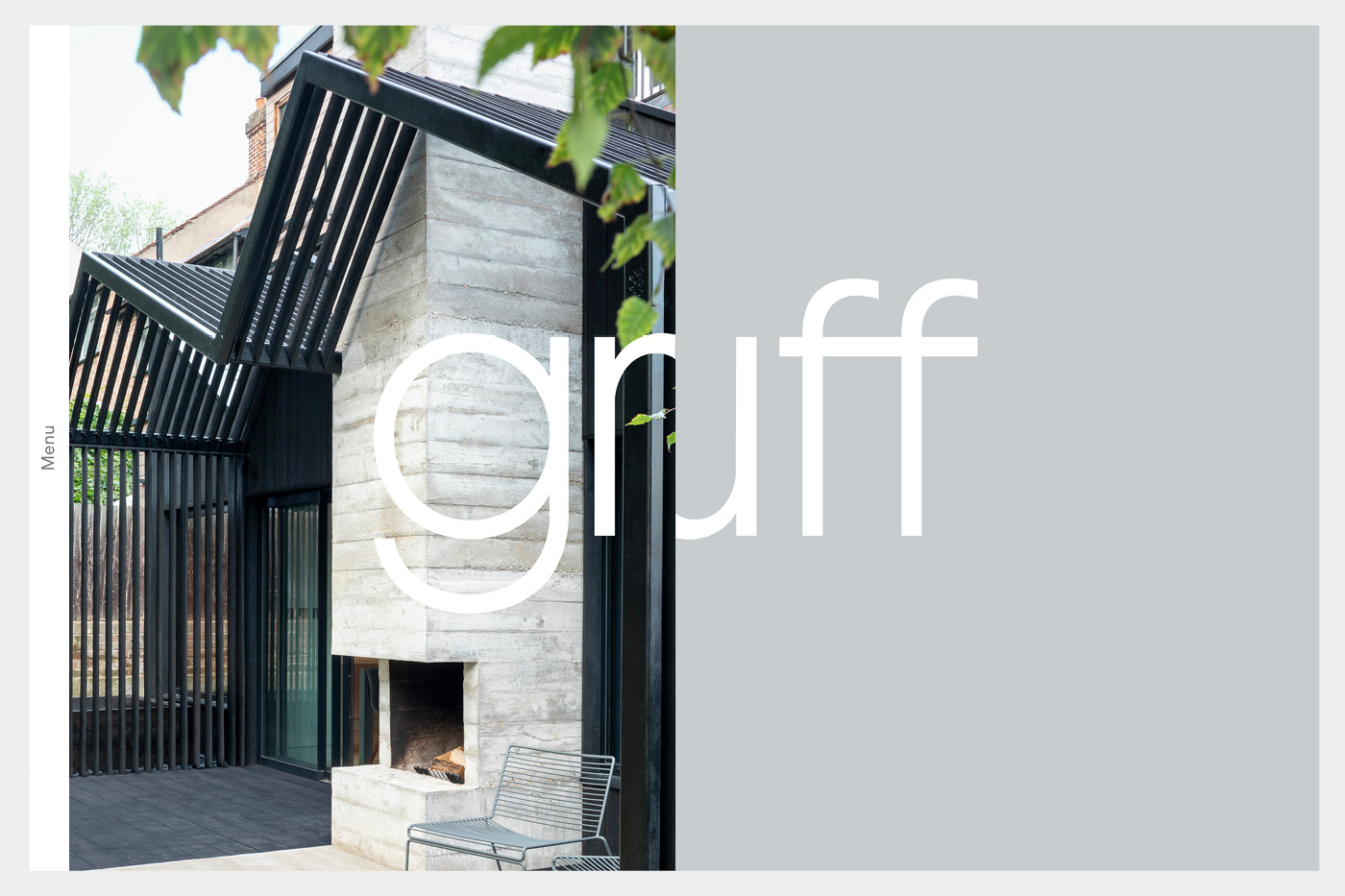
One website that made one the most impression from landing was Gruff Architects with their lovely use of typography on the logo that felt integrated into the imagery. Throughout the site, the level of photography is high and it’s a very simple and easy to use site.
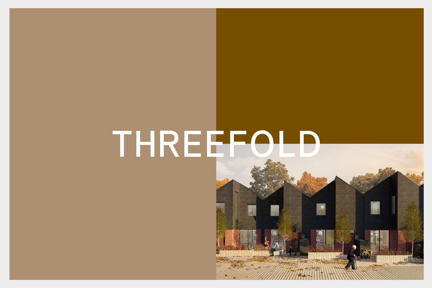
What Threefold have done nicely is create an intro that stems from their name. Three blocks of colour combined with an image which changes colours and imagery every time you visit the site. Their latest section is a great feed that really gives a sense what this practice is about.
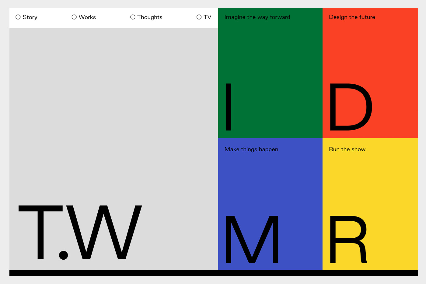
A lot of architect’s websites can be very white or grey but this site from Turner Works you notice and remember from the off. Simple block colours and lovely use of typography is very refreshing coming from an industry that can play it safe.
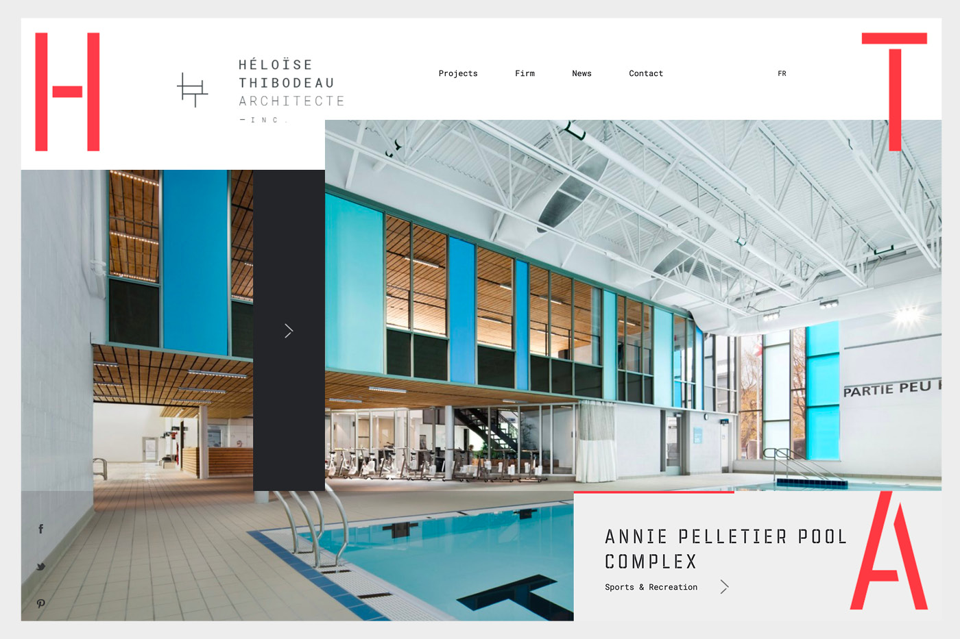
The site from Heloise Thibodeau Architecte Inc is bold with a punchy red and a stencil headline font to stand out. Surprisingly, most websites use the same style sans-serif font. It’s one thing we believe at ikon is investing in typography as a differentiator and it definitely works here.
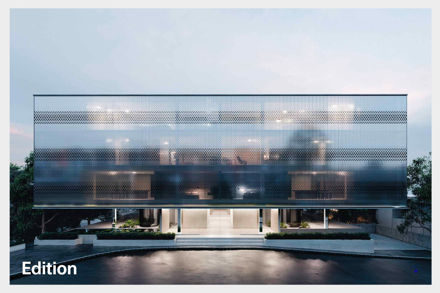
No better case in point than Edition. They have gone so understated they cover your screen with a beautiful image and just their logo summed up by their opening line “There’s a sense of freedom in distillation”.
One of the most unique architecture websites is from Herzog & de Meuron. Everything from the typography, functionality and lack of even a logo makes it stand out from a sea of similar style websites. For me it’s interesting and memorable but doesn’t quite cut it to create an emotional connection to make me feel like I would love to work with them even though their work is incredible.
Instead of a traditional menu, the concertina approach from EDA is very novel and does make you interact with the website in a different way which does make you feel they are not the same as all the rest. It does fall down a little on some of the imagery which could be much stronger.
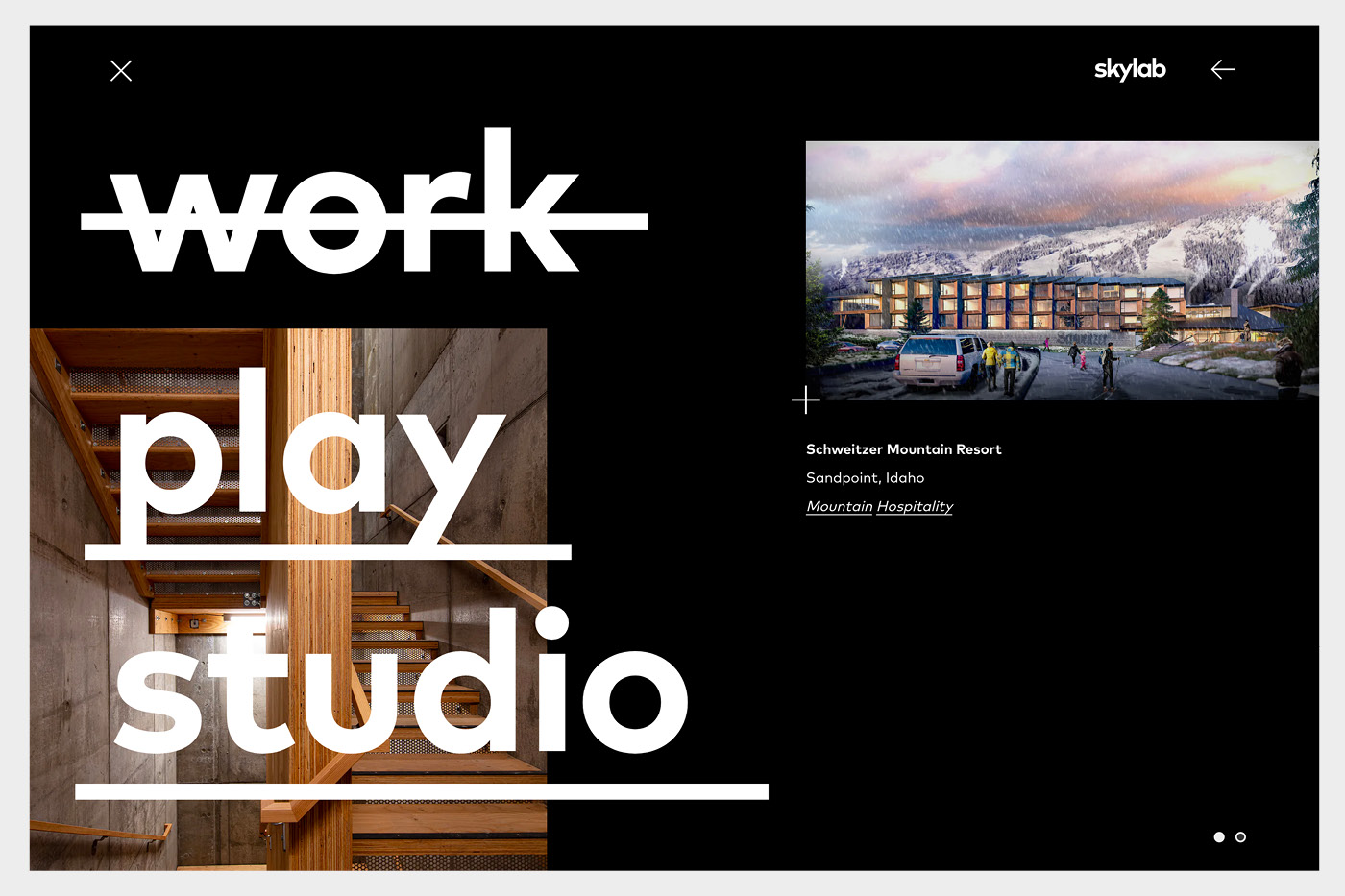
Skylab Architecture has got a really nice mix of a bold menu but very simplistic usability which feels more sophisticated than a lot of other architect’s websites. As with our website at ikon which features a lot of black backgrounds, the colour evokes strength, power, authority and elegance.
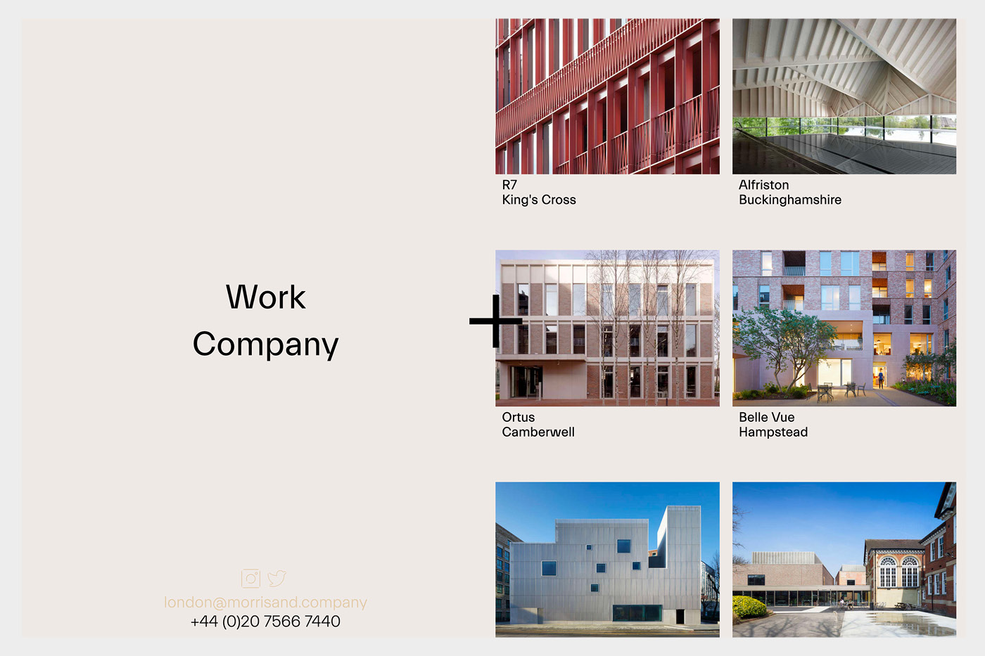
The Morris + Company website is relatively simple but it’s simplicity done well. Their choice of font is similar to other architects but different enough to be distinct. The split vertical screen when scrolling projects is interesting and makes the site more memorable.
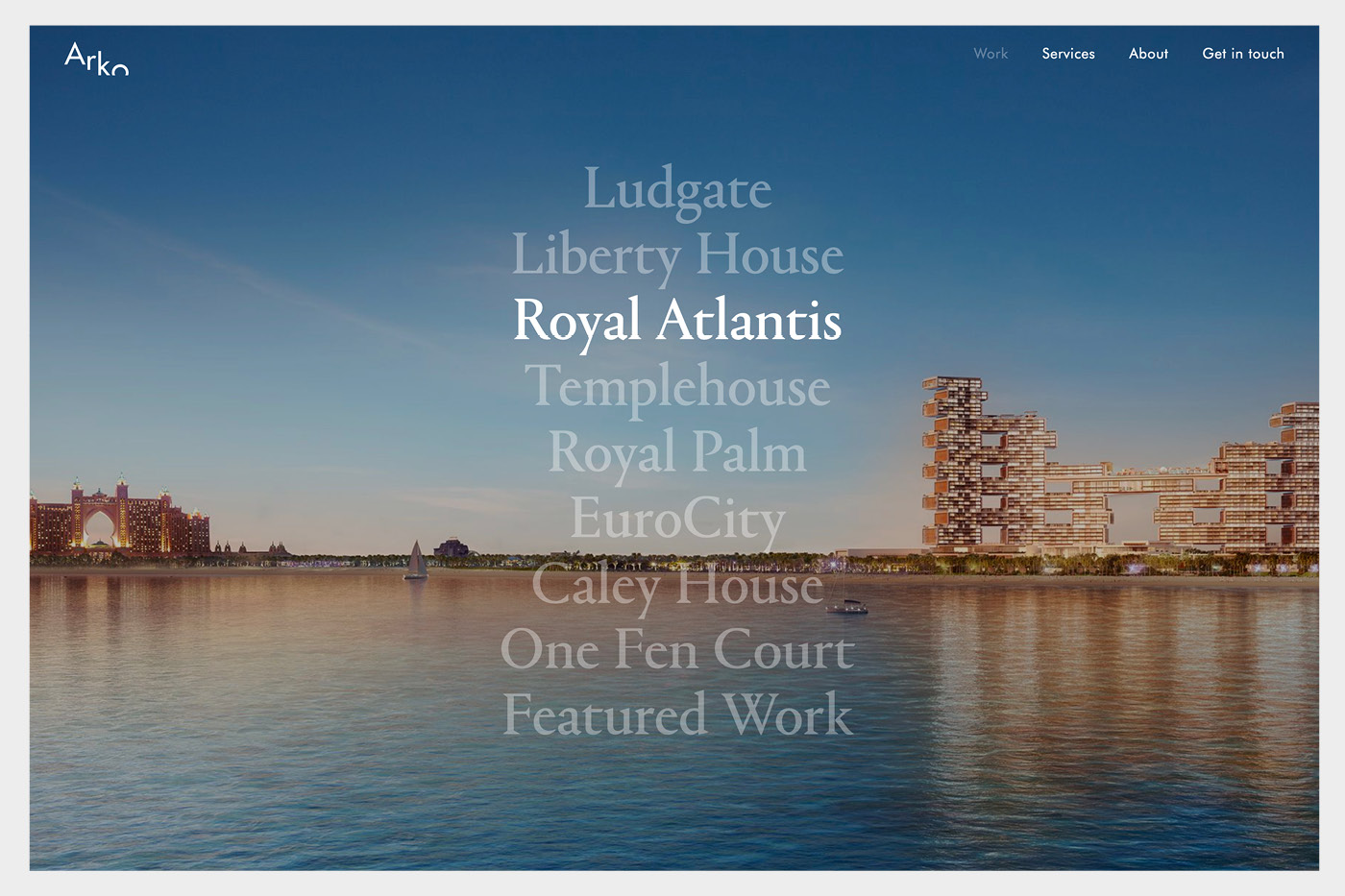
Arko has a lovely rollover full screen menu for their projects page which is really simple but so elegant. It helps their visualisations are exceptional but it’s a quick and easy way to see their select projects full screen very quickly in a very interactive way.
All throughout the Hyde + Hyde website you can see the effort and consideration paid to everything from their imagery to their words. It gives a sense that if you work with them, you are in safe hands and that attention to detail will show through if you commission them. If you can evoke this sense of trust and quality, you are pretty much sold without speaking to them.

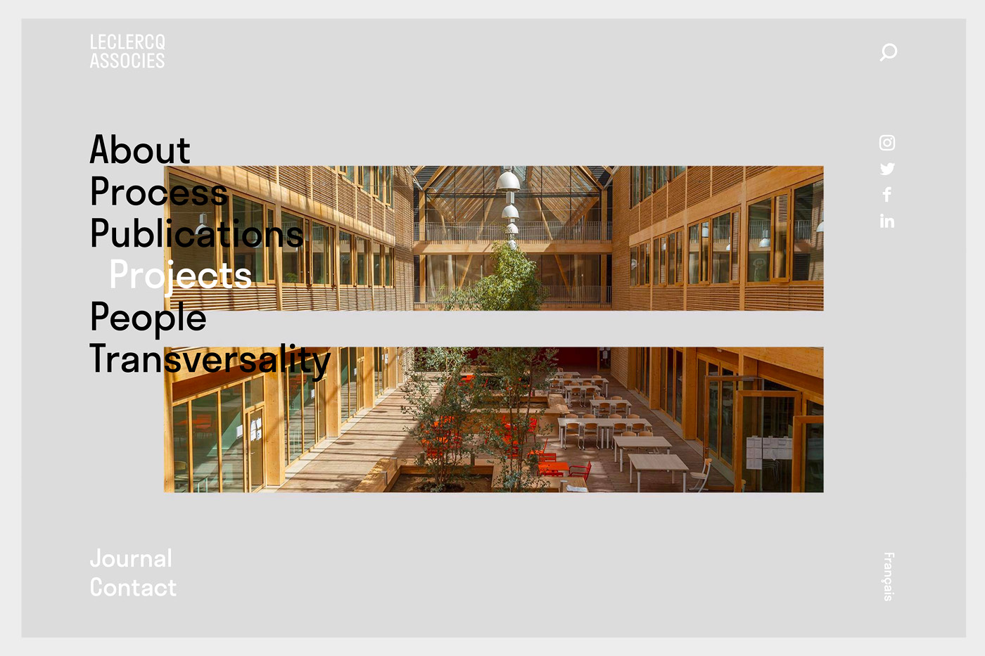
Leclercq Associes have added elements of motion throughout the site making the usability very smooth. From transitions on the menu to how the pages transition to the next, it’s very well animated. Even the rollovers on the projects to show multiple images is a really nice touch.
If after reading this, you think you have to improve your website to compete with the best, we are more than happy to give you any advice on how our website design agency can create impact within your practice.