It's becoming increasing harder to stand out especially in the architecture and interior design industry where everyone has beautiful imagery. This article is to inspire you with visuals and give practical advice on what you can leverage with your branding to position your practice, making your marketing just as beautiful as your work.
Here goes with the best branding for architects & interior designers we have seen.
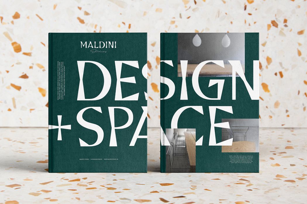
We start with Maldini Studios, an interior design and carpentry firm by Jens Nilsson. It's not a typical approach to the industry but it utilises a bespoke typeface that seems to nod to the carpentry element of the business as letters seem to be chiseled. A combination of the colour and typography that you don't often see in architecture and interiors, it does and will stand out against the competition.
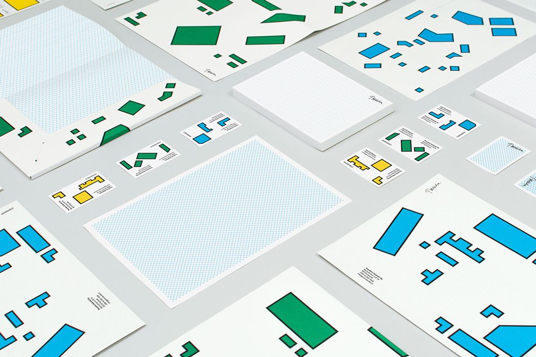
Architects can have a tendency to choose white, greys or blacks when branding their practice so it's refreshing to see something a little more playful and colourful from Poseidon Helsinki by Kokoro & Moi. Inspired by Le Corbusier and the masters of geometric abstraction, it definitely stands out and allows for a flexible identity. Our luxury interior design branding agency recommends our clients embrace the boldness of color and geometric shapes, as it not only enhances brand recognition but also creates a memorable, dynamic visual experience that sets them apart. By using vibrant hues and distinctive patterns, Poseidon Helsinki successfully communicates creativity, sophistication, and modernity, aligning perfectly with the values of luxury design.
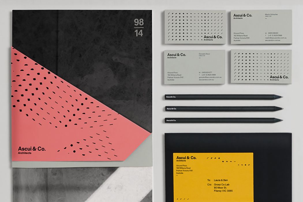
This is a really nice idea that is suggestive of the 3D nature of buildings from Ascui & Co. Architects by Grosz Co. Lab. The patterns feel like an object lit from certain angles of a light source, this combined with different colours that resemble 'temperatures'. The identity becomes flexible in pattern and colour to suit the intention of what is being designed.
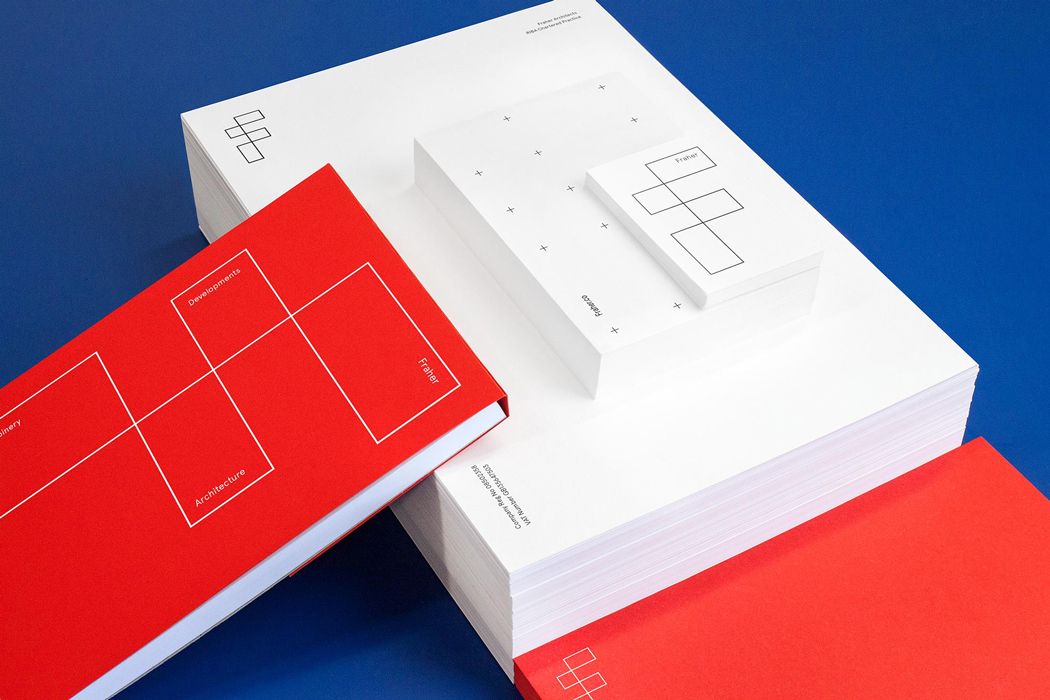
The next project is Fraher Architects by Freytag Anderson. The use of a very bold red catches your attention and the logo is designed to adapt into a flexible device that can be used to house images and text.
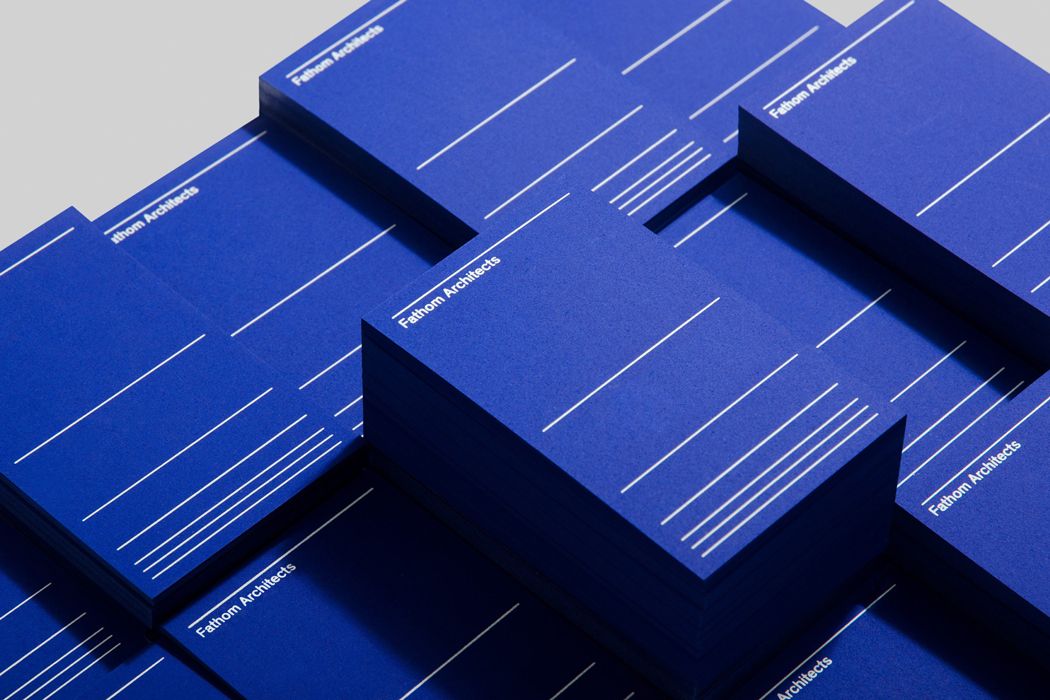
Your name is just as important as your visual identity. DN&Co named and created the branding for Fathom Architects which stemmed from two meanings. The first to measure depth and two, to show a deeper understanding of a difficult problem. The lines are suggestive of measurement and help define areas for text and imagery across the rest of Fathom's branding.
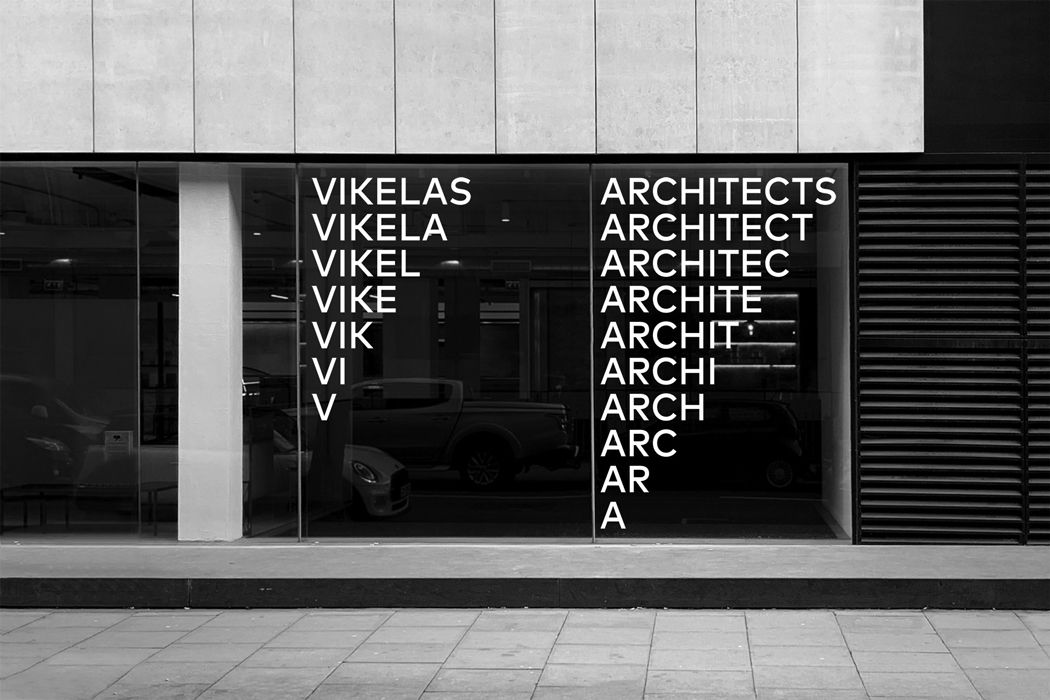
A very simple idea from AG Design Agency for Vikelas Architects. They created a typographic system that works not only with the logo but across all the branding. It's different and it definitely makes you stop and look.
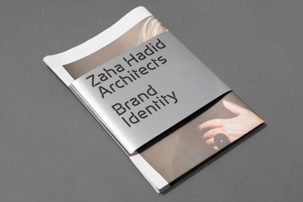
Zaha Hadid is one of the world's most famous architects of recent times and a core element of their branding by Greenspace, is a bespoke typeface. Using type as a differentiating factor is so often under utilised in branding so if you don't have the budget for something custom, pay attention to your typography as it's an integral part of your brand.
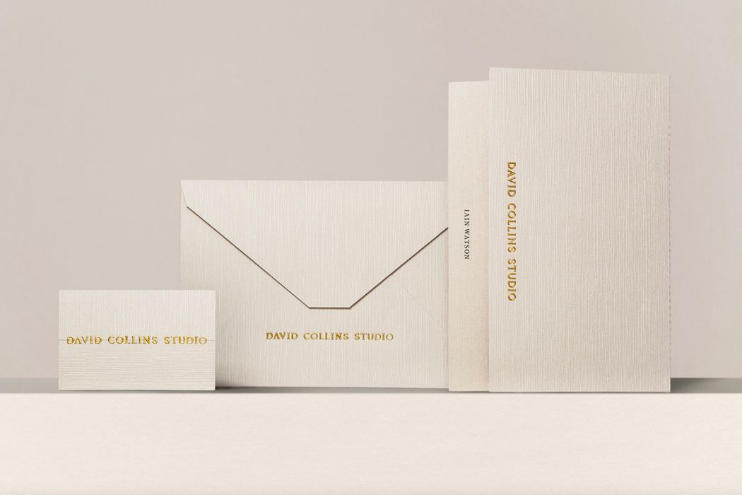
The renowned David Collins interior architecture practice, created a very understated identity with the help of Bibliothèque Design. Again, a bespoke typeface was at the heart of the identity but close attention was given to paper, textures and finishing which can create something special in print.
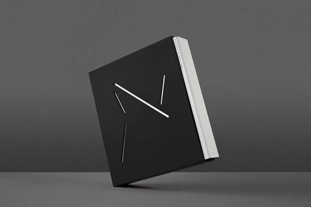
The concept for this project was based on the structural principle of 'tensegrity' which is very apt for the structural engineering firm Nosive Strukture, designed by Bunch. Sometimes all you need is a strong concept and everything else will flow from it.
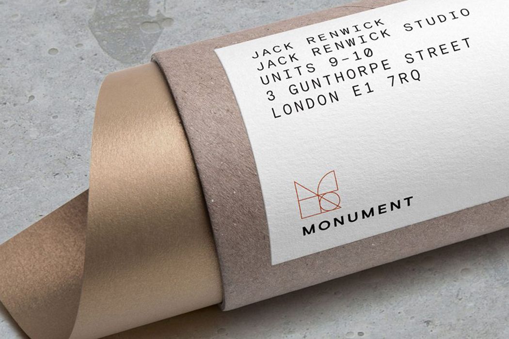
The basics being the circle, triangle and square are the building blocks of architectural design which makes up this logo from Monument by Jack Renwick.
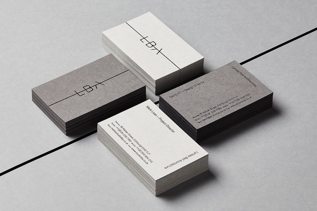
A keyline as a device is prominent across all of the branding for Lynsay Bell Architecture by Touch Agency. The aim was to signify the forward progression, momentum and growth of the practice. Sometimes the simplest idea can translate across all your marketing when it's executed well.
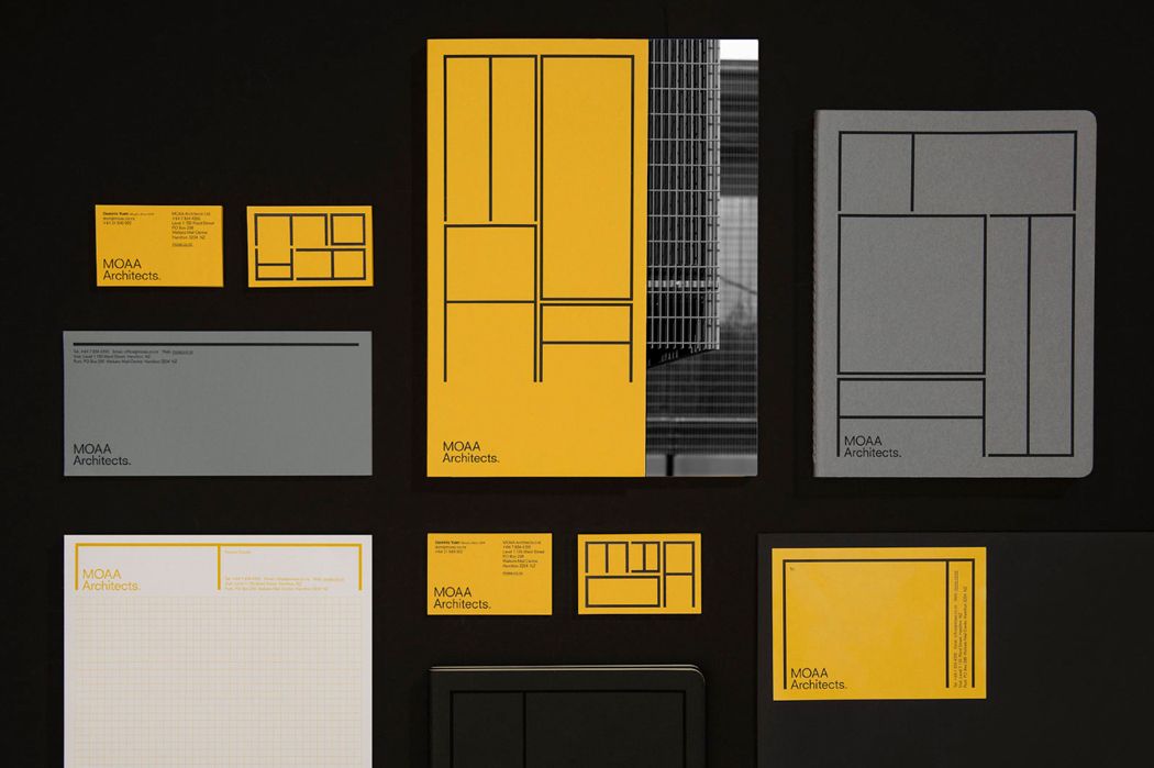
Identities have to be more and more responsive these days. From a billboard right down to a logo on an iphone. MOAA Architects by Inhouse created a responsive identity that is recognisable over many different formats which works nicely. The only downside being, you need someone who knows what they are doing with future applications to execute and retain the integrity of this setup.
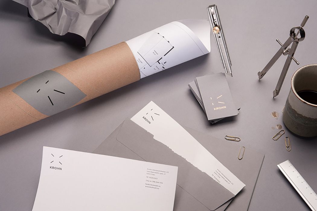
Inspiration can come from anywhere but the best ideas tend to be abstract rather than literal. Commando Group designed a dynamic logo for Krohn based on a room seen from a central perspective.
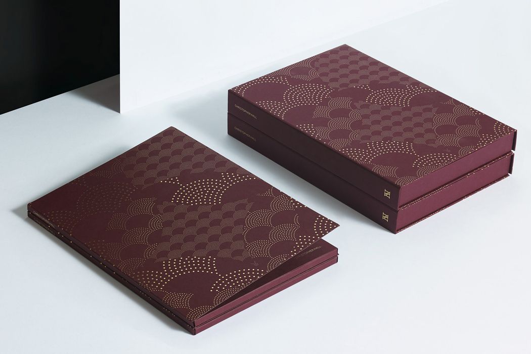
A lot of branding within the industry can be quite stark, so it's nice to add some texture and personality. In this instance, Christopher Hall, a furniture and interior designer worked with Two Times Elliott to express elements of his Somata collection that was rooted in mythology. The pattern references snake scales used within the pieces.
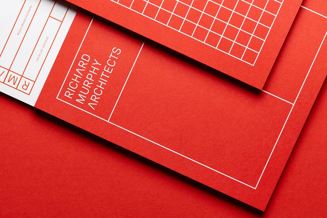
The grid in design is there for a reason and this identity for Richard Murphy Architects by Touch Agency, utilises it to the fullest. The geometry is suggestive of their measured and methodical approach.
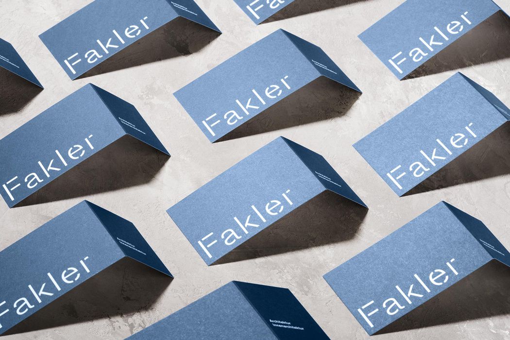
It's not too often you see a stencil typeface within branding for architects, so it does add intrigue. This project for Falker by Hammeral Brecht also adds a nice element in print with a folded business card that gives a 3D element to their business cards.
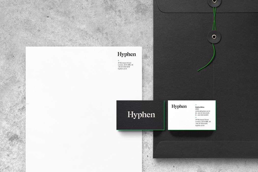
Sometimes all you need in a flash of brand colour to make your branding distinguishable. Hyphen by Pentagram sets a nice balance between minimal and timeless with a green a lot of architects would probably deem too bright.
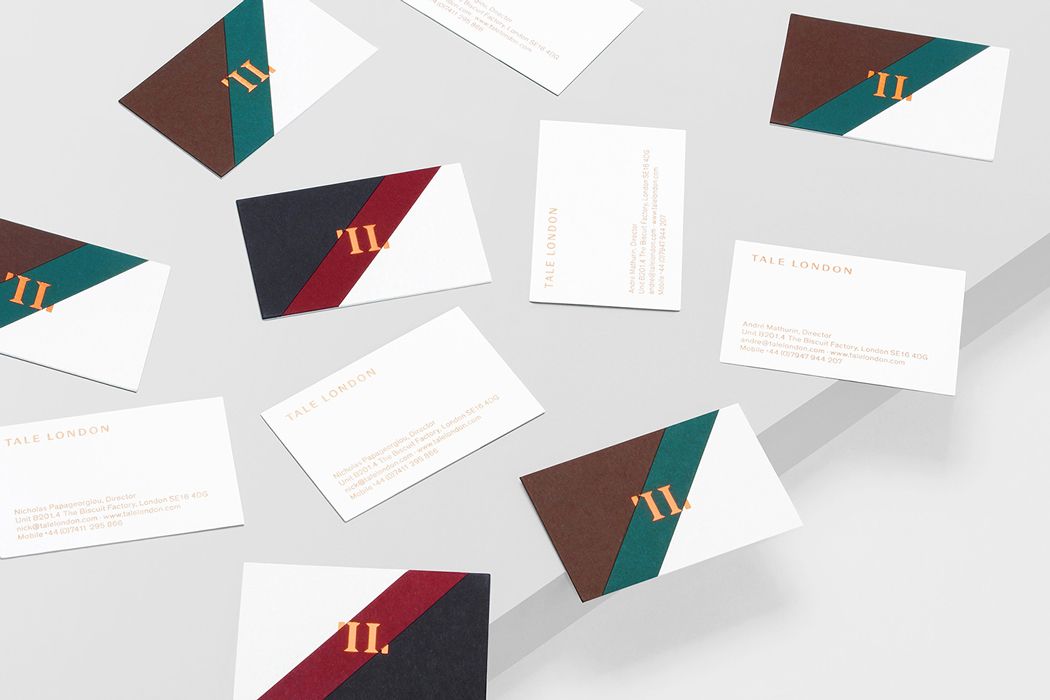
If you are a business in a creative industry, having a good understanding of colour theory is absolutely essential. So why not express it in your stationery. Tale London by Two Times Elliott is a bold example of how you can use colour to your advantage.
If after reading this, you think you have to improve your branding to start attracting bigger and more profitable clients, we have a well mapped out process we can take you through. It's helping a £5m client on their way to £15m and we have even put ourselves through it which has attracted numerous architecture and interior practices to renowned luxury brands such as Cartier.