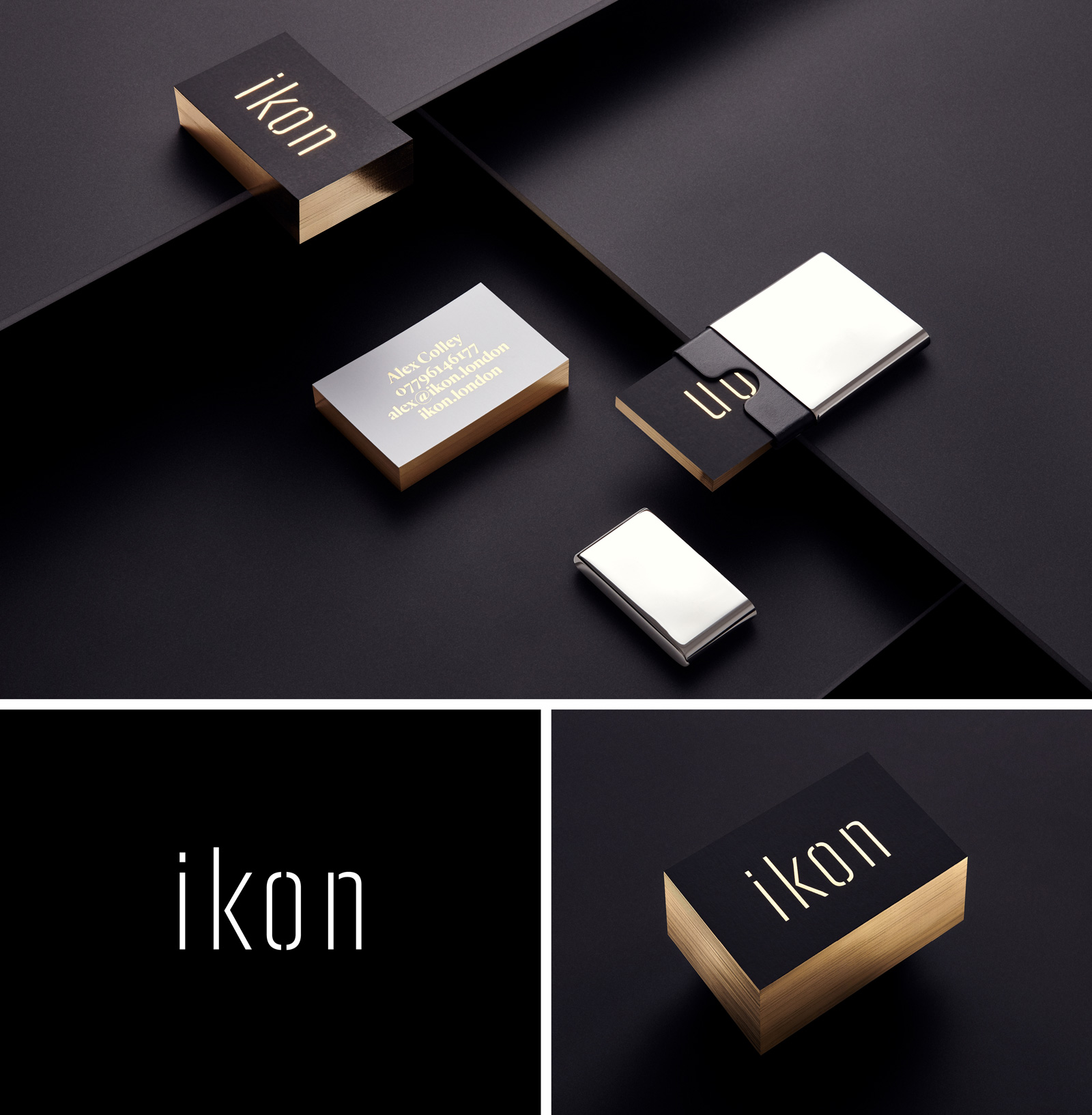
Selected identity work from ikon. Built for founders and senior leaders who understand that how a brand is seen determines what it can charge.
Full strategy, process, and commercial outcomes are covered in our case studies. If you're ready to talk, start a conversation.
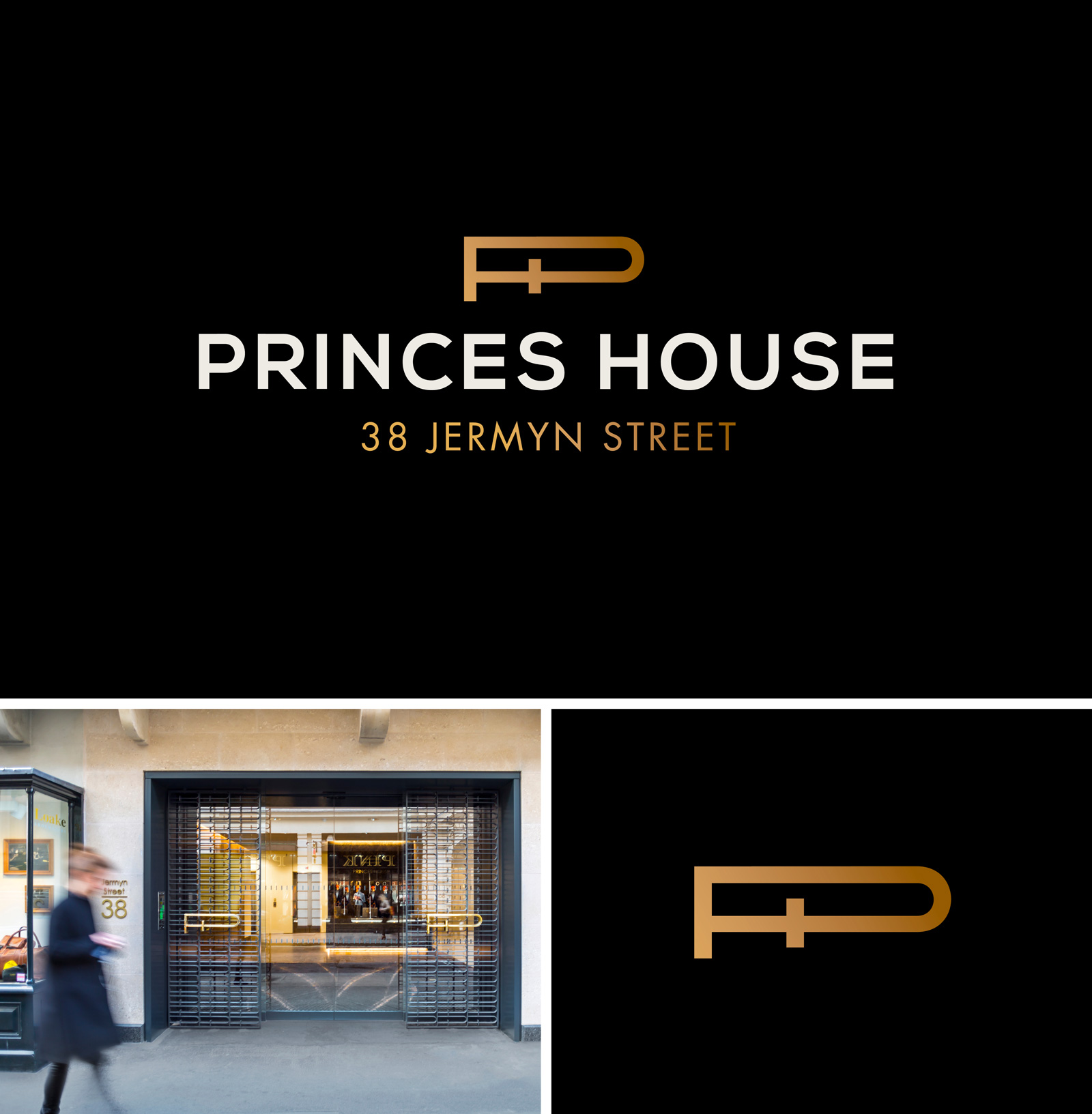
Identity and monogram for a private property development on Jermyn Street, London.
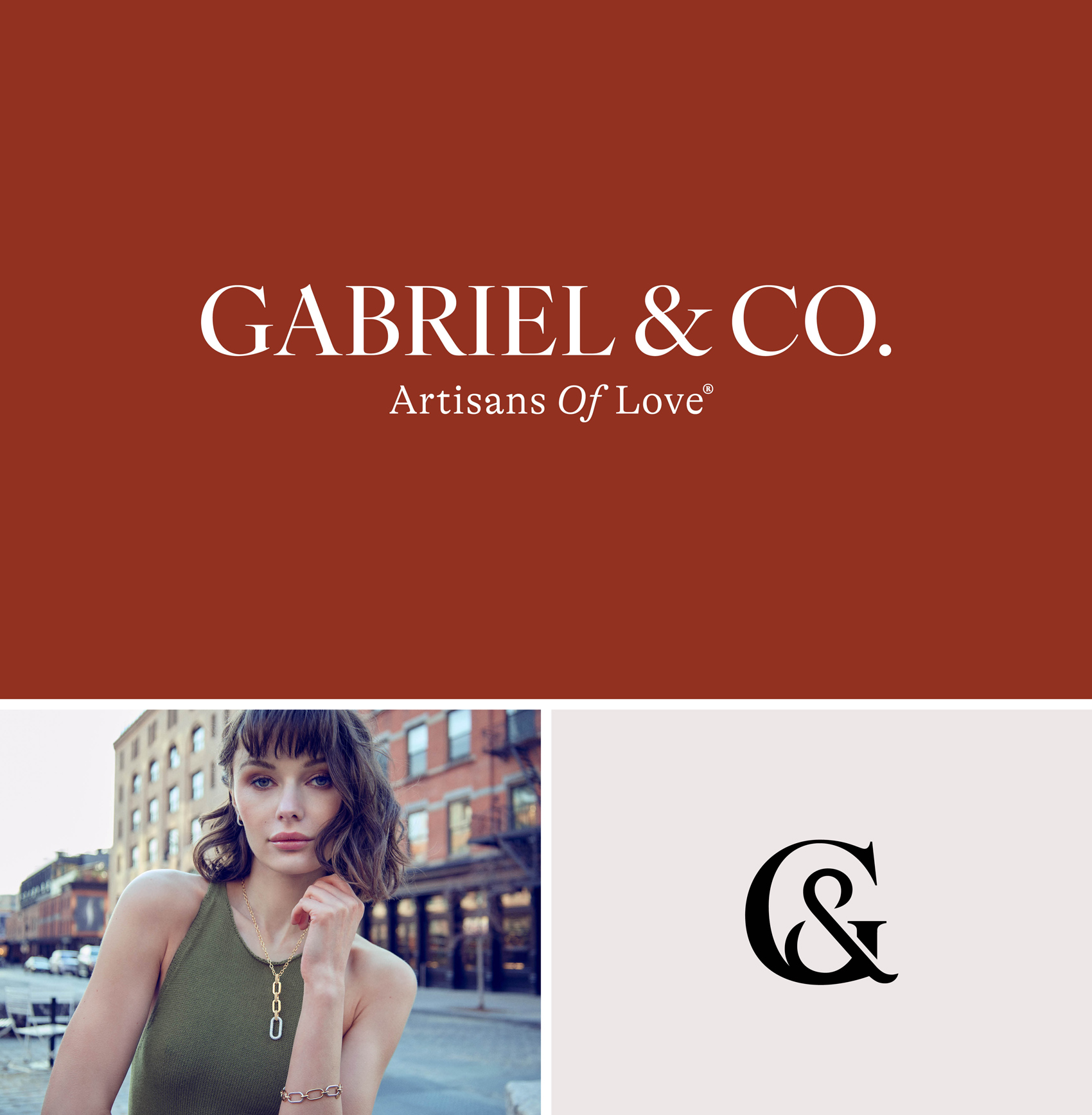
Gabriel & Co. required an evolution of their existing identity. Typography and a reworked monogram were central to elevating the brand for a more affluent audience within the premium and luxury jewellery market.
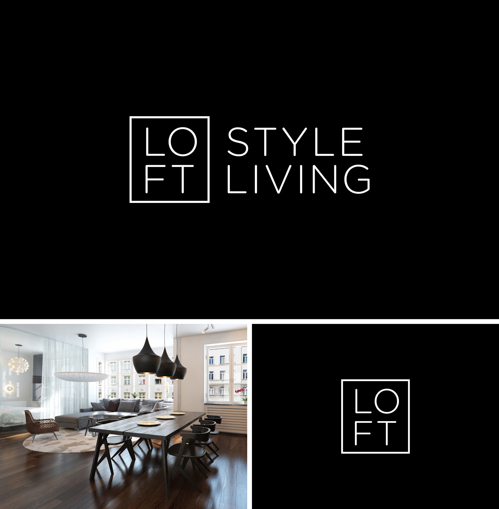
Identity for Loft Style Living. Designed to echo the simplicity and quality of their architecture.
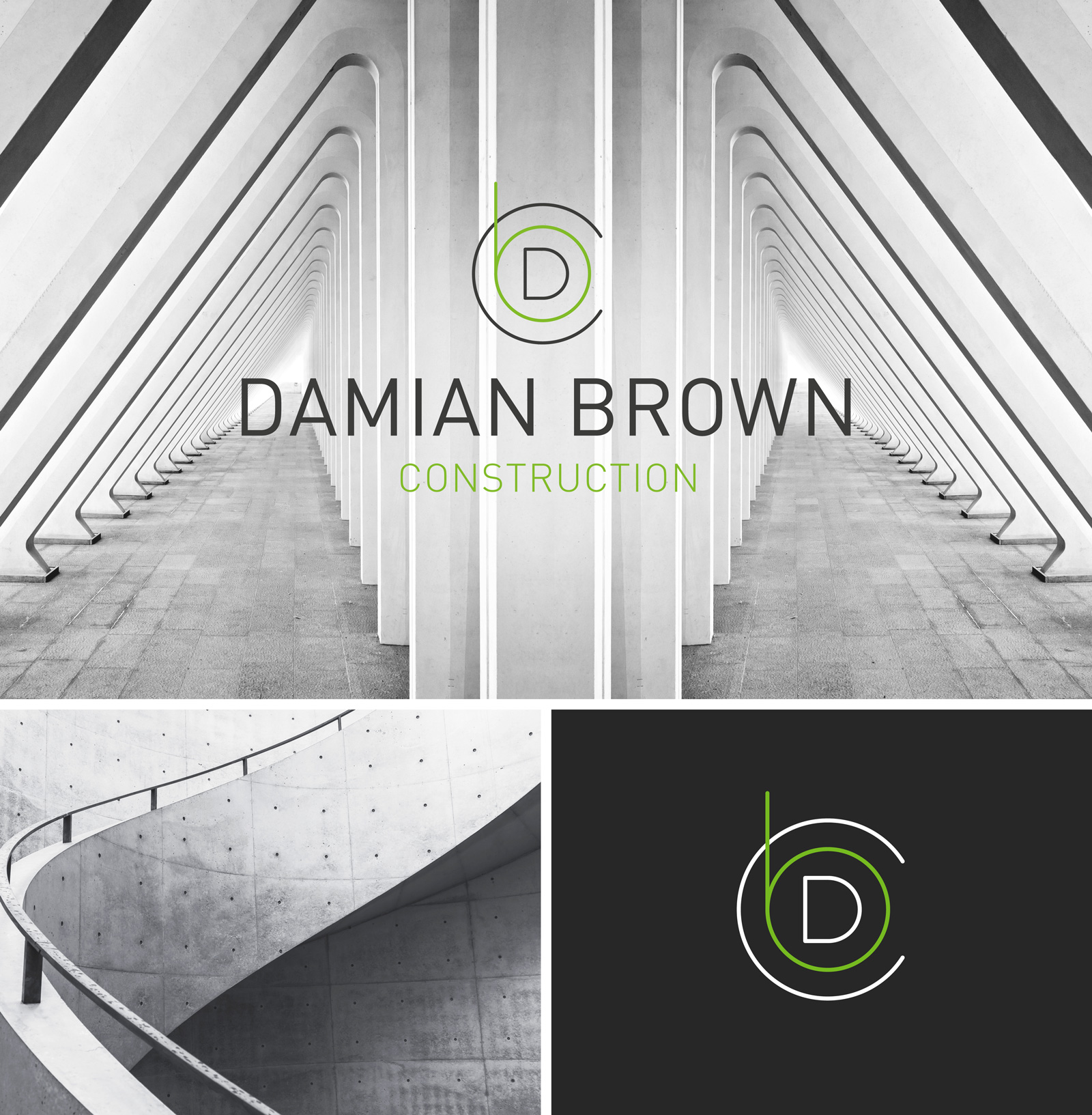
A monogram built from the letters D, B, and C, designed to convey a premium aesthetic through simplicity. Monochrome imagery reinforces the brand’s focus on quality and restraint.
If you advise on branding, you hold yourself to the same standard.
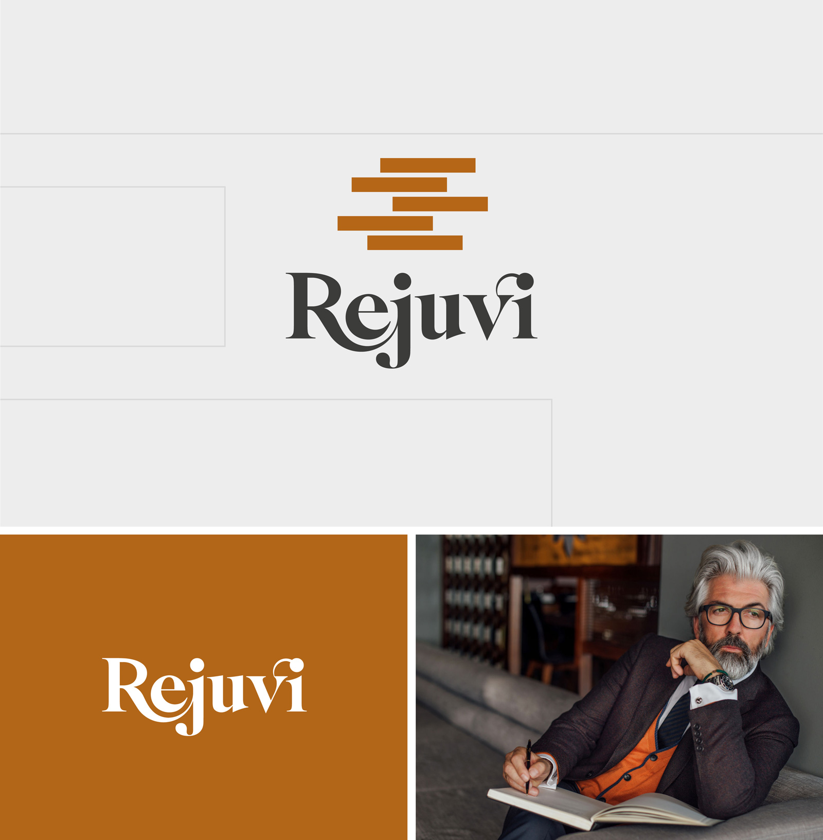
The identity draws from the building blocks of successful businesses and Rejuvi’s proprietary scoring methodology, used to analyse performance and develop exceptional leaders. A custom wordmark completes an identity designed specifically for Rejuvi.
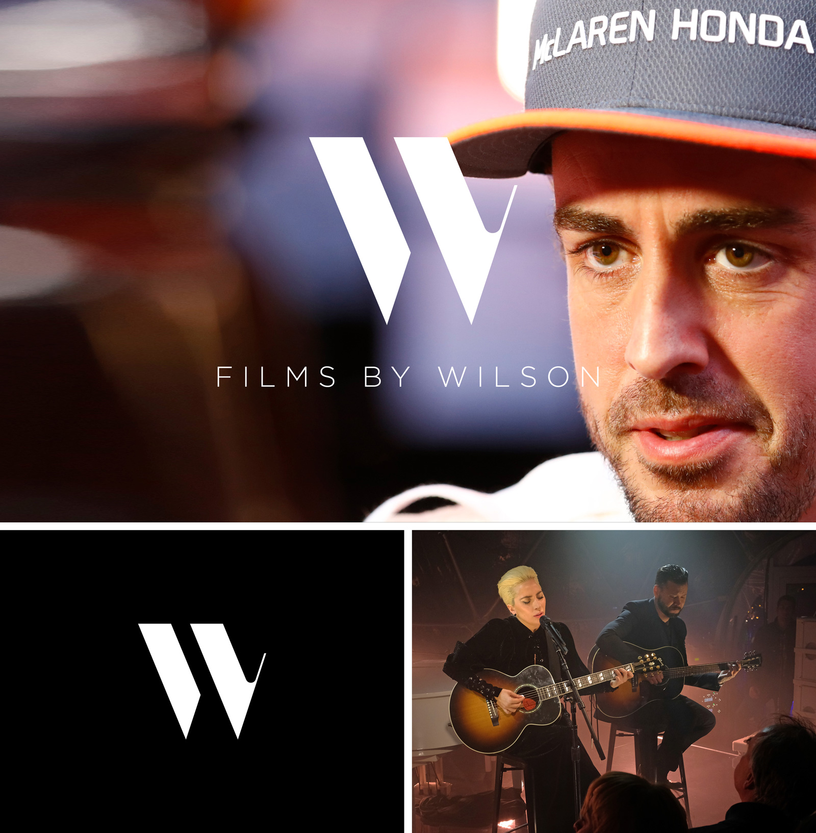
Identity for Films by Wilson, the first European production company commissioned by Amazon Studios. A simple ‘W’ mark ensures clarity and memorability.
We’ve reduced brand identity to its essentials. One considered process and one clear outcome — distinctiveness.
It’s a process we’ve tested on ourselves. One that’s attracted some of the world’s most respected luxury brands, including Cartier and Mandarin Oriental and it’s supported a luxury healthcare client’s growth from £5m toward £15m.
Considering a new brand identity? Let’s talk.