Brief
Gabriel & Co. had strong heritage and recognition in New York, but their brand lacked the consistency and clarity required to compete at a more premium level. The ambition was to reposition the business upmarket, creating a more refined and distinctive presence across every touchpoint.
Solution
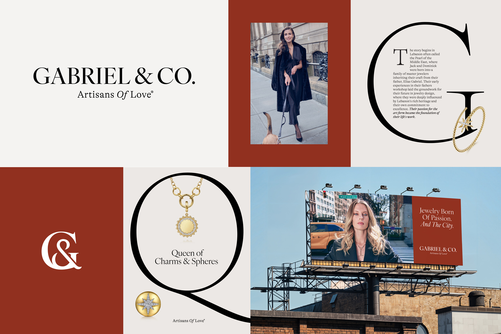
We created a brand system designed to bring clarity and control to how the brand is experienced. A refined visual language establishes a more premium position, supported by clear guidelines to ensure consistency over time. Built in close collaboration with the founders and marketing team, the result is a brand designed for longevity, not trend, capable of supporting the business as it moves upmarket.
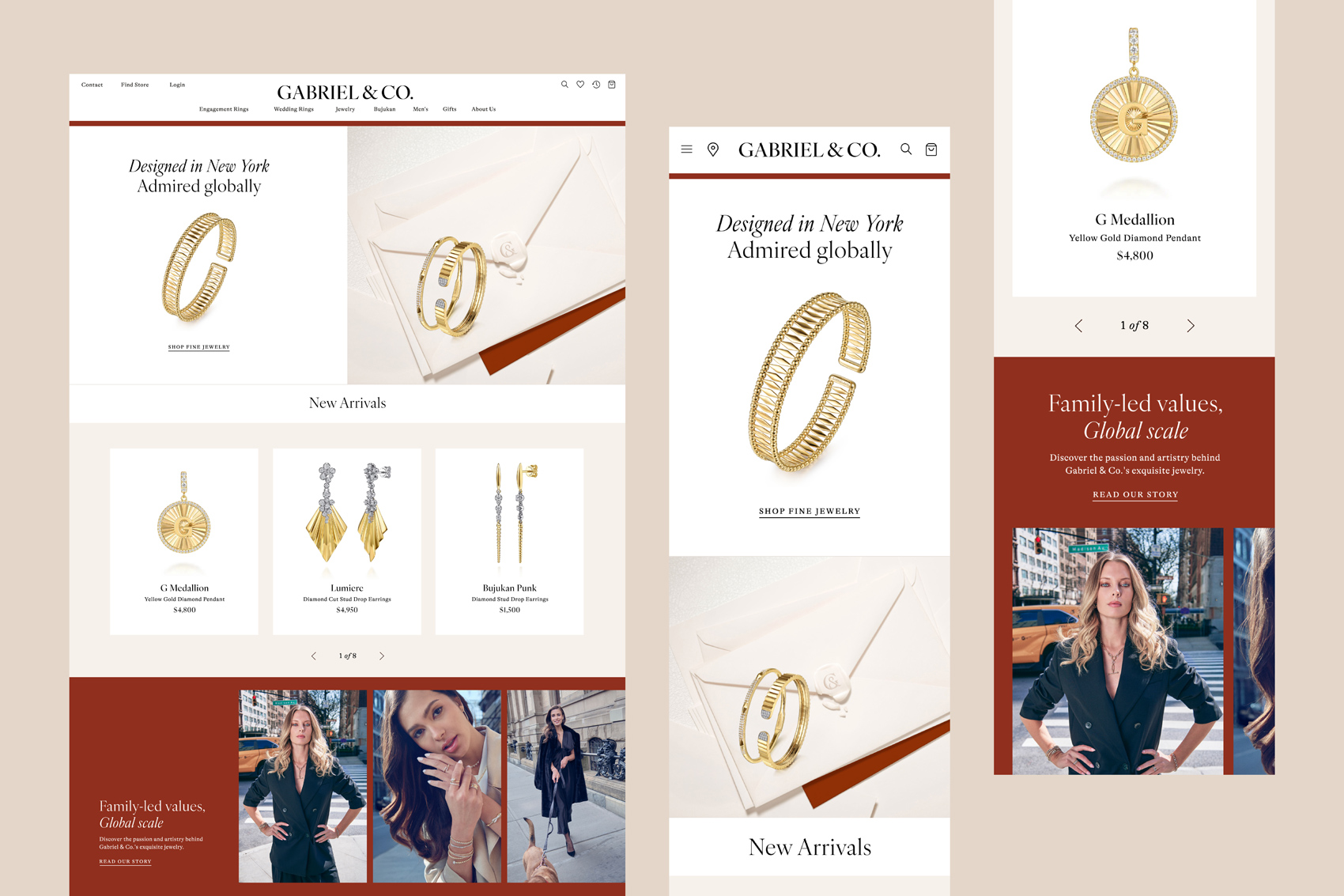
Typography became the foundation of the transformation. The wordmark was refined with precision, creating a mark that feels both timeless and unmistakable. The monogram follows the same principle, distilled to its purest form to work seamlessly across applications, from embossed leather packaging to a refined digital presence.
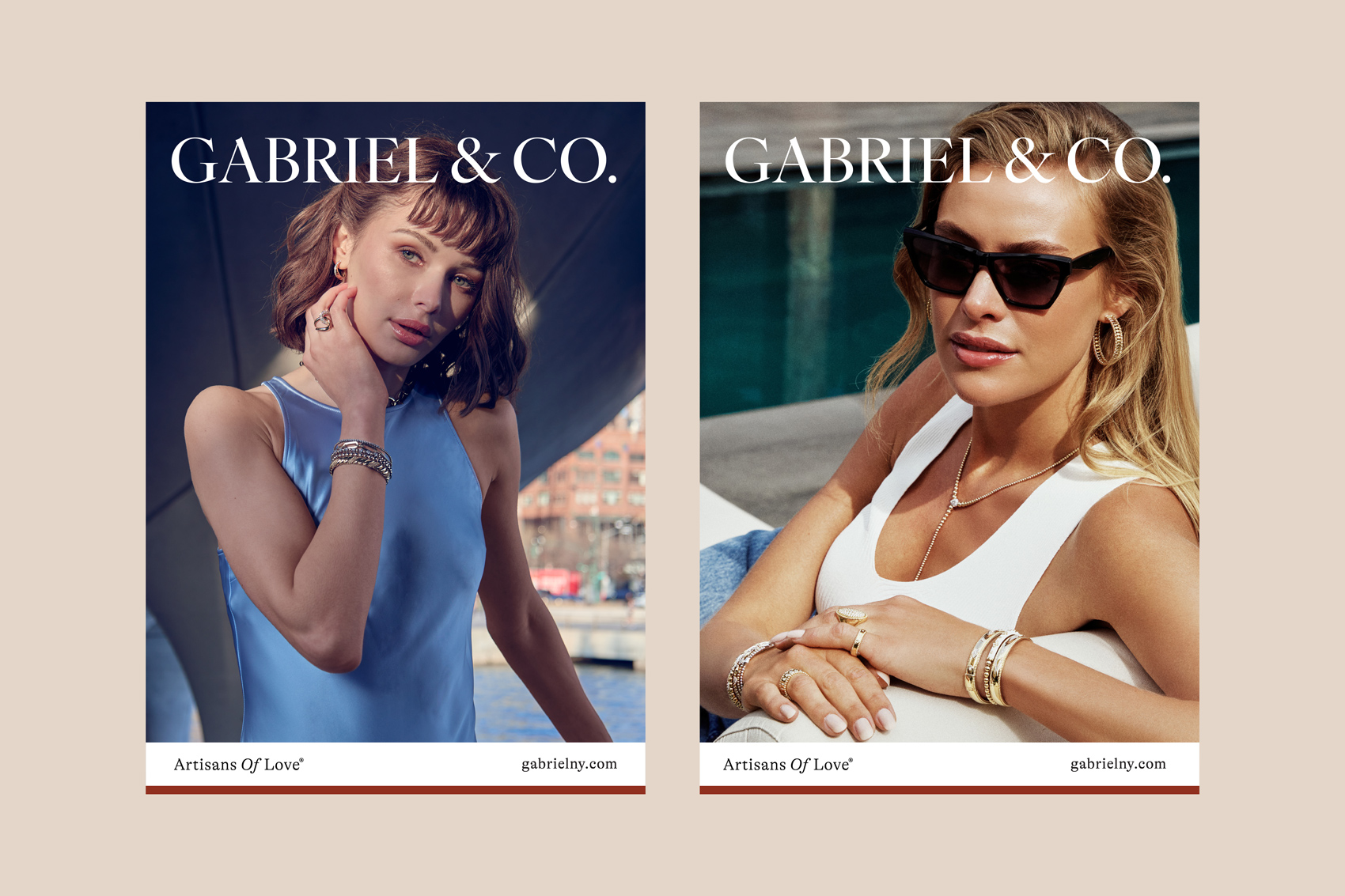
The result is a brand system that reflects the quality of their craft. Clear guidelines bring consistency and control, giving the Gabriel & Co. team the confidence to execute across every touchpoint. The right identity doesn’t just elevate perception, it creates a foundation for long-term growth.

What was at risk wasn’t just inconsistency, it was perception. Without a clear identity, the brand was leaving value on the table. The work focused on closing that gap, aligning how the brand shows up with the level it operates at.
