Brief
Grgich Hills Estate needed to modernise its identity to stand apart in a conventional wine market. The ambition was to attract a younger, more conscious audience without losing the trust built over decades, while ensuring the brand remained relevant as the category evolves.
Solution
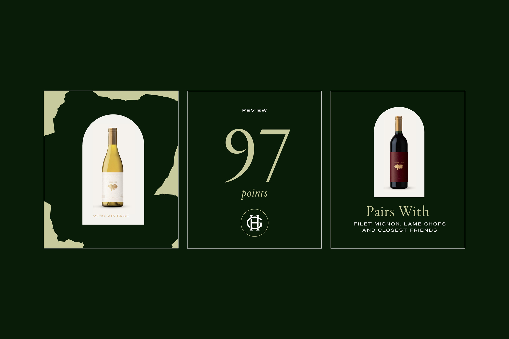
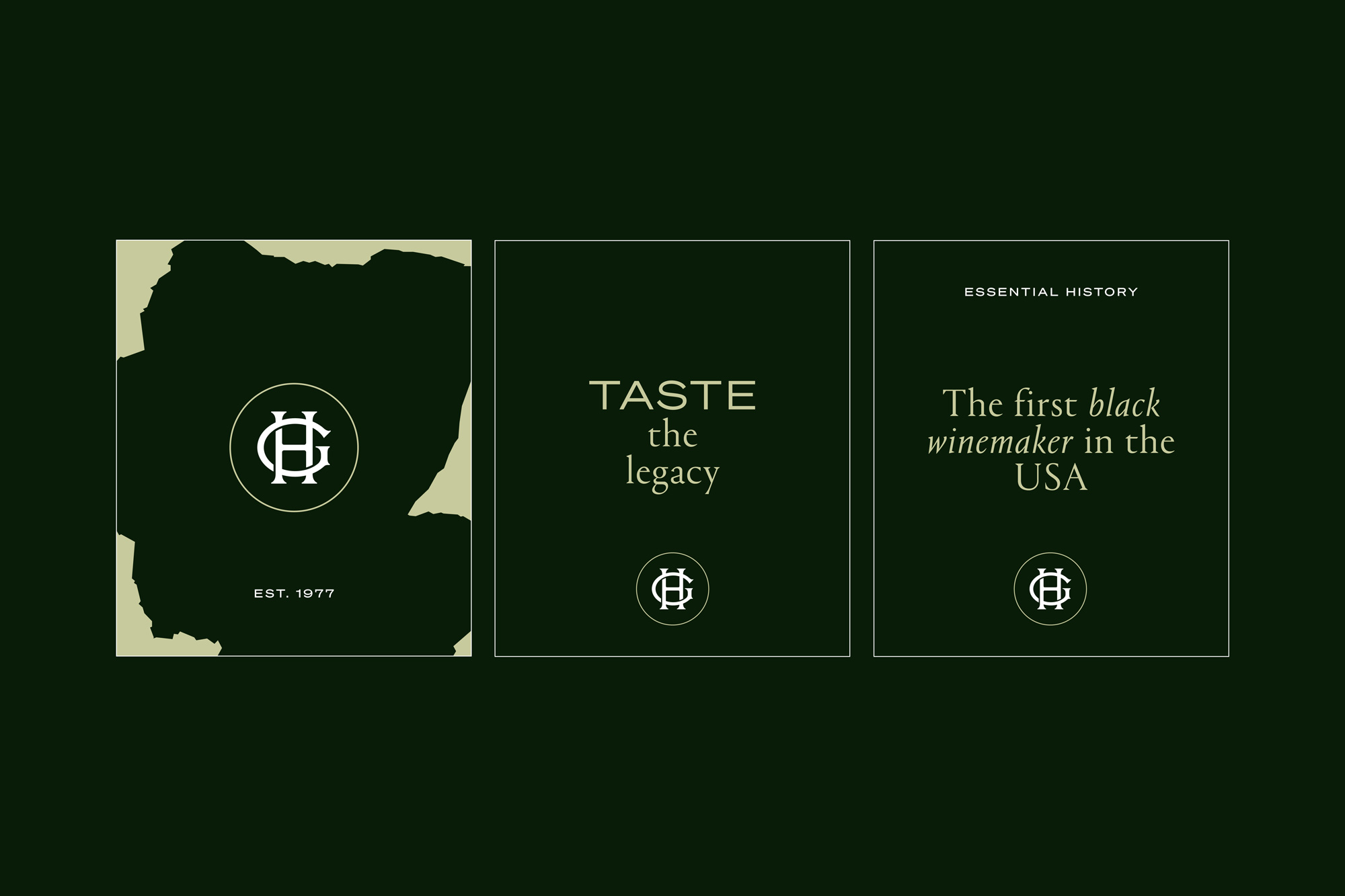
We evolved the identity to feel more contemporary without compromising its heritage. Typography was refined for clarity and restraint, a distinctive colour introduced to strengthen recognition, and clear guidelines established to ensure consistency across every touchpoint.
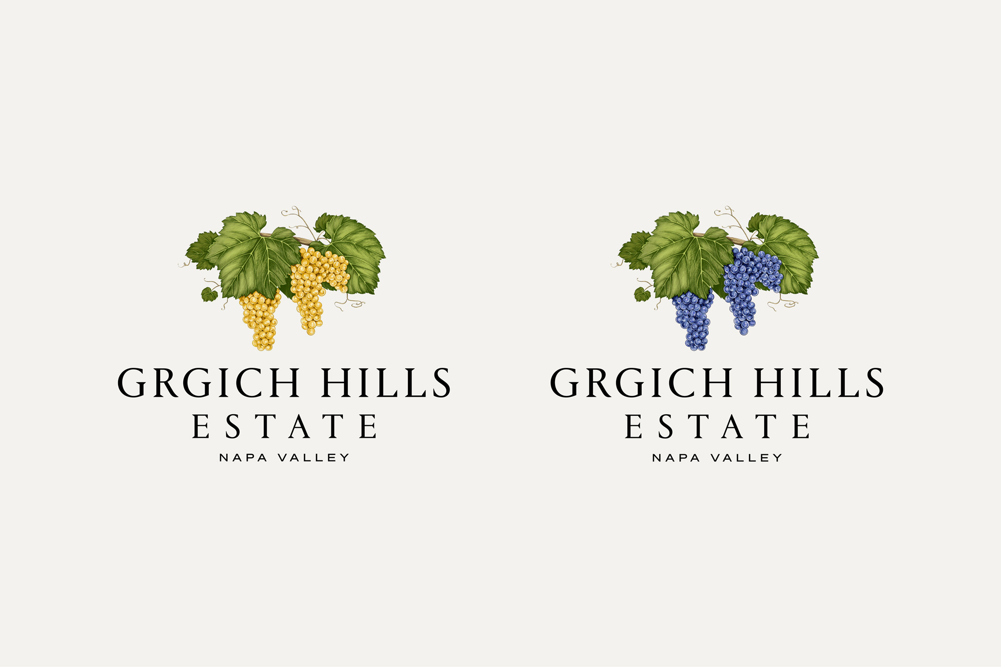
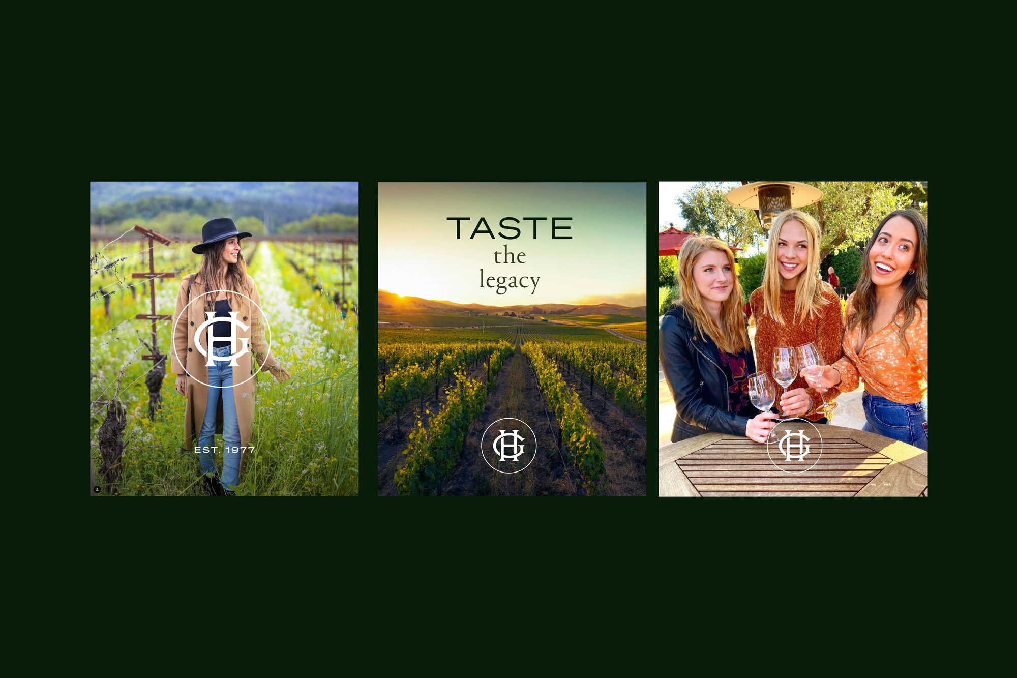
Refining the typography created the greatest impact, elevating the wordmark and every brand touchpoint. The result is a mark that feels both modern and timeless. This was paired with a simplified monogram designed to perform across every application, from social media to foil bottle tops.
The result is a confident and cohesive brand identity that reflects the quality of the wine itself. Consistency across every touchpoint is helping strengthen recognition and positions the brand to resonate with a new generation of buyers.