A brand identity transcends logos or colors—it’s the essence of a business, a visual and verbal narrative shaping its global presence. Exceptional identities emerge from precision, strategy, and target audience insight, not chance. For businesses vying for distinction, brand identity examples reveal the impact of smart design and positioning.
This article delves into six examples—Edelweiss, W11 Construction, Mandarin Oriental, Preventicum, Raiola, and Westfield—each a testament to how strategic design and positioning elevate brands on an international stage. These cases, drawn from our work, showcase the power of aligning aesthetics, messaging, and functionality to meet ambitious goals, whether launching a new collection or redefining an industry leader’s presence.
Alex can help you create a strong brand identity to attract premium customers. Book a free brand discovery call to find out more.
We are a leading brand identity agency, transforms vision into results for luxury, healthcare, and sports clients. This article explores real-world examples—like reimagining a luxury piano maker’s site or redefining a football agency—revealing the process driving success. It also covers a proven methodology and the value of a brand identity audit. For those seeking inspiration or a sharper brand, this is the starting point. Let's go over 6 brand identity examples.
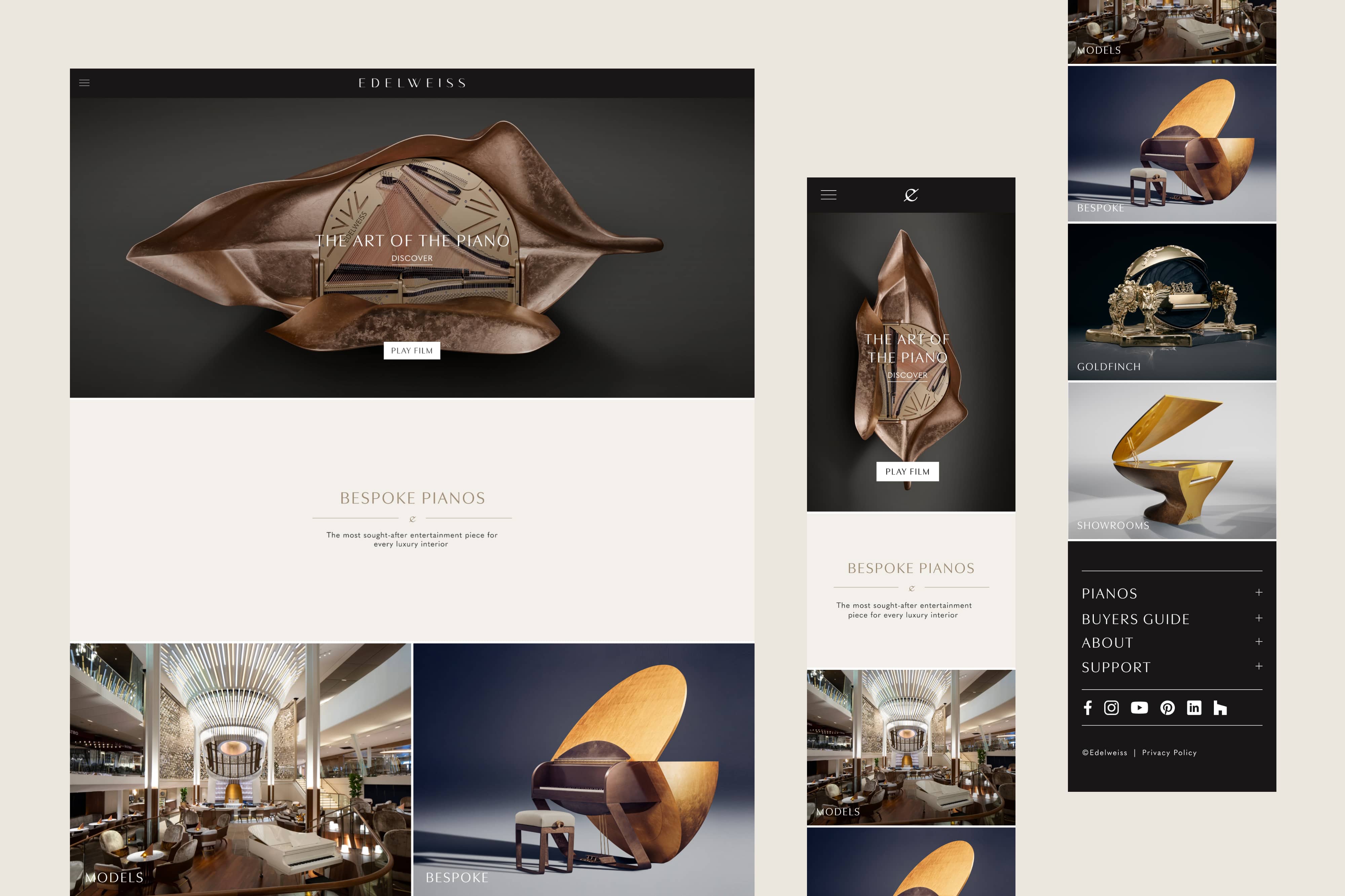
A luxury piano maker like Edelweiss demands a digital presence as refined as its instruments, yet their existing website fell short—lacking visual appeal and intuitive navigation. The brief called for a complete overhaul to align with the debut of a new piano collection, elevating both design and user experience to match the brand’s prestige.
Analysis of Google Analytics and user screen recordings pinpointed high-traffic pages, guiding a streamlined site structure that eliminated clutter and enhanced usability.
The solution prioritised responsive design, ensuring seamless performance across devices, from desktops to mobiles, with aesthetics mirroring the pianos’ elegance. This strategic revamp transformed a lackluster platform into a showcase worthy of a luxury artisan, timed perfectly for the collection launch.
A strong brand identity hinges on consistency and alignment with core brand values, which Edelweiss achieves through this redesign.
The simplified navigation and responsive luxury site design reflect the precision and accessibility of a luxury product, ensuring the digital experience mirrors the pianos’ craftsmanship.
By syncing the site’s launch with a new collection, the identity reinforces timeliness and relevance—key traits for a premium brand. Visual elegance ties directly to the brand’s heritage, creating a cohesive narrative that resonates with discerning customers. This case demonstrates how functionality and aesthetics can unite to amplify a brand’s essence.
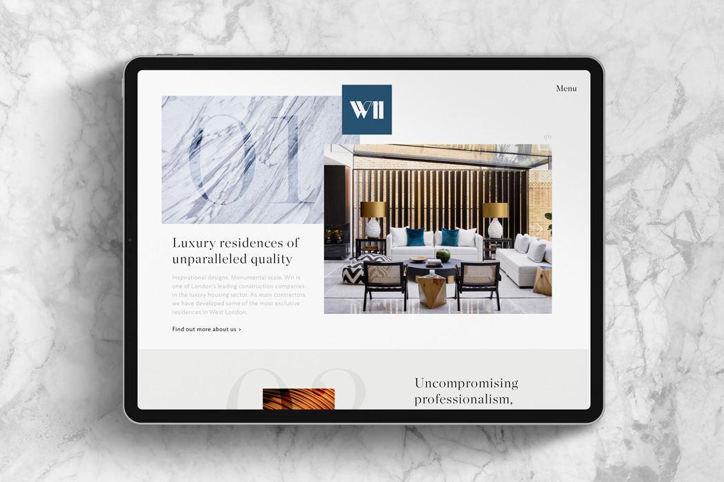
W11 Construction, a builder of multimillion-pound residences, sought to cement its status as an industry leader without leaning on clichéd luxury imagery—a challenge requiring nuanced branding. The objective demanded a fresh identity and a luxury website as striking as their properties, with messaging that radiated authority and sophistication.
The solution focused on showcasing the careful craftsmanship, premium materials, and obsessive attention to detail defining W11’s work, sidestepping generic visuals for substance-driven appeal. A responsive website emerged as the centerpiece, blending bold design with clear, consistent communication to position W11 as the go-to name in exclusive residences. This digital brand asset now serves as their primary marketing tool, proving luxury can speak through quality, not just opulence.
W11 Construction’s identity stands out by prioritising authenticity over superficiality, a hallmark of enduring brands. Highlighting craftsmanship and materials rather than lavish visuals establishes a unique voice in a luxury market, fostering trust and credibility.
The responsive website ensures accessibility while maintaining a premium feel, reflecting the brand’s commitment to excellence across touchpoints. Consistent messaging reinforces leadership, making W11 memorable without relying on tropes. This approach showcases how a strong identity can differentiate through substance and strategic restraint.
Mandarin Oriental’s latest venture—a rooftop bar in Mayfair—required a menu that echoed the Asian-inspired elegance of its adjacent ABar lounge while exuding exclusivity for discerning guests. The brief demanded a concept-to-completion design that felt premium yet cohesive with the bar’s cloud-and-sky-themed interior.
A premium cover featuring a mottled effect was selected, subtly nodding to the celestial motif, paired with screw fixings for practical menu updates. Inside, carefully chosen papers delivered a pared-back luxury aesthetic, ensuring cocktails, wines, spirits, and dishes shone as the stars of the experience. This tailored solution elevated the menu into a tactile extension of the bar’s identity, enhancing the guest journey with understated sophistication.
This menu design for Mandarin Oriental epitomises a strong brand identity through its seamless integration of theme and purpose. The mottled cover and Asian-inspired cohesion tie directly to the bar’s narrative, creating a sensory link that deepens guest immersion.
Practicality via screw fixings balances luxury with functionality, a subtle nod to thoughtful execution that elite brands master. The restrained yet premium aesthetic ensures the focus remains on the offerings, reinforcing exclusivity without ostentation. It’s a prime example of how physical touchpoints can extend a brand’s story with elegance and intent.

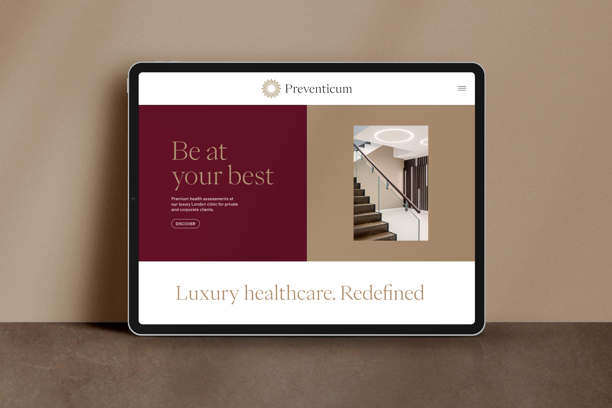
Preventicum, a £5m-turnover healthcare business, aimed to triple its revenue to £15m, necessitating a bold new strategy and identity to propel it forward in a competitive field. The brief required a comprehensive assessment—engaging senior leaders and key clients—to craft a future-focused direction distinct from the typical blue-and-green healthcare palette.
Drawing inspiration from luxury branding, the solution introduced a striking core color and an illustration style that broke from convention, offering visual differentiation in a saturated market. Verbal identity was sharpened to match, reinforcing Preventicum’s premium positioning with clarity and confidence. This rebrand carved out a unique space, blending healthcare credibility with the allure of high-end aesthetics.
Preventicum’s rebrand showcases a strong identity by boldly diverging from industry norms, a move that signals confidence and vision. The luxury-inspired color and illustrations disrupt the healthcare sector’s predictability, making the brand instantly recognisable and memorable.
Strategic alignment with a £15m goal reflects ambition baked into the identity, resonating with upscale clients seeking premium care. Verbal clarity complements the visuals, ensuring the brand speaks with authority and purpose. This case highlights how differentiation and coherence create a standout identity in a sea of sameness.
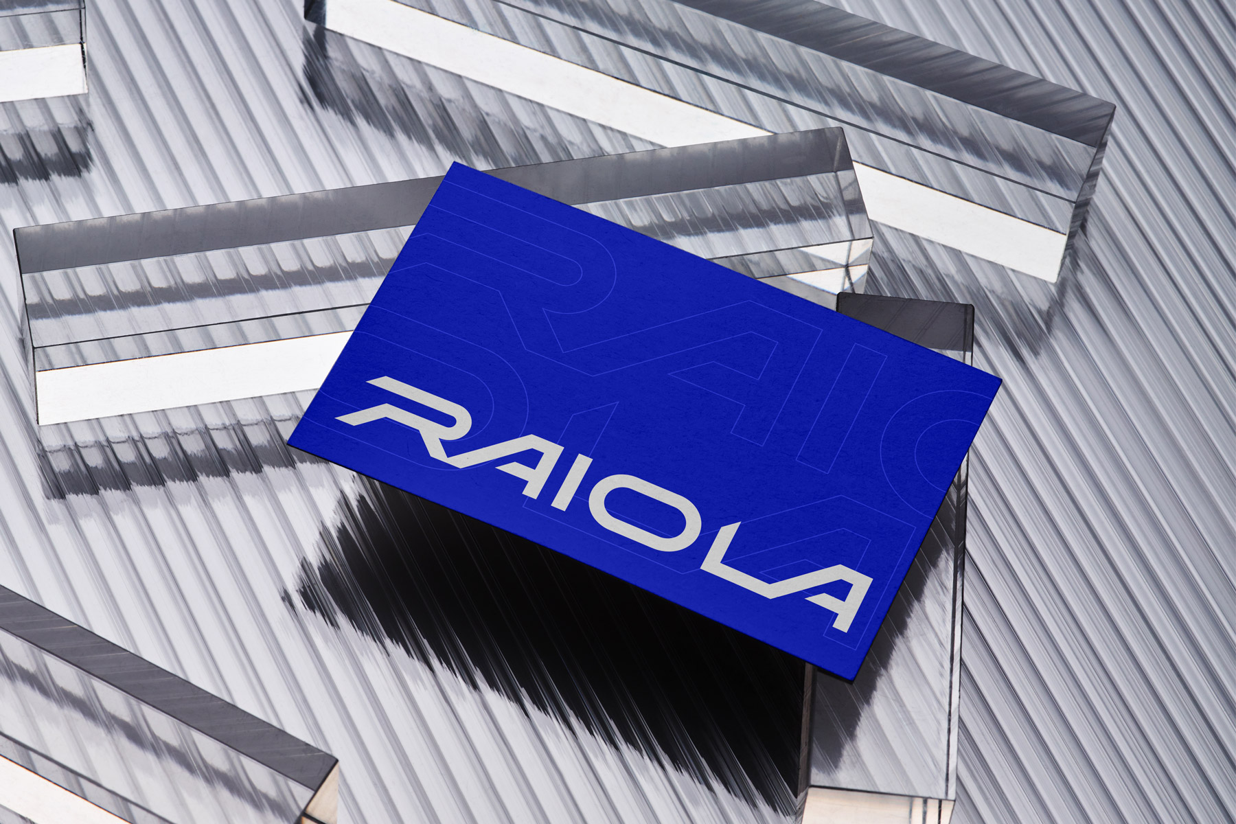
Raiola, building on the legacy of legendary football agent Mino Raiola, sought to establish itself as the premier 360-degree agency for the world’s top footballers, with a digital-first brand at its core. The brief demanded a strong system capable of flexing across platforms, reflecting excellence and modernity in a fast-paced industry.
The "Made For Excellence" concept took shape, anchored by a 45-degree arrow motif that doubled as an X, a chevron, or a framing device—versatile enough for diverse graphic applications. This dynamic identity rolled out seamlessly across social media and digital touchpoints, future-proofing Raiola’s presence. The result positions the agency as a global leader, marrying heritage with cutting-edge design.
Raiola’s identity excels by blending legacy with innovation, a balance that defines top-tier brands. The "Made For Excellence" ethos, paired with a flexible arrow system, projects ambition and adaptability—crucial for a digital-first, global audience.
Versatility across platforms ensures consistency, a cornerstone of brand strength, while honoring Mino Raiola’s heritage adds emotional depth. The modern design signals forward-thinking leadership in football, appealing to elite talent. This example proves a strong identity can evolve a storied past into a future-facing powerhouse.
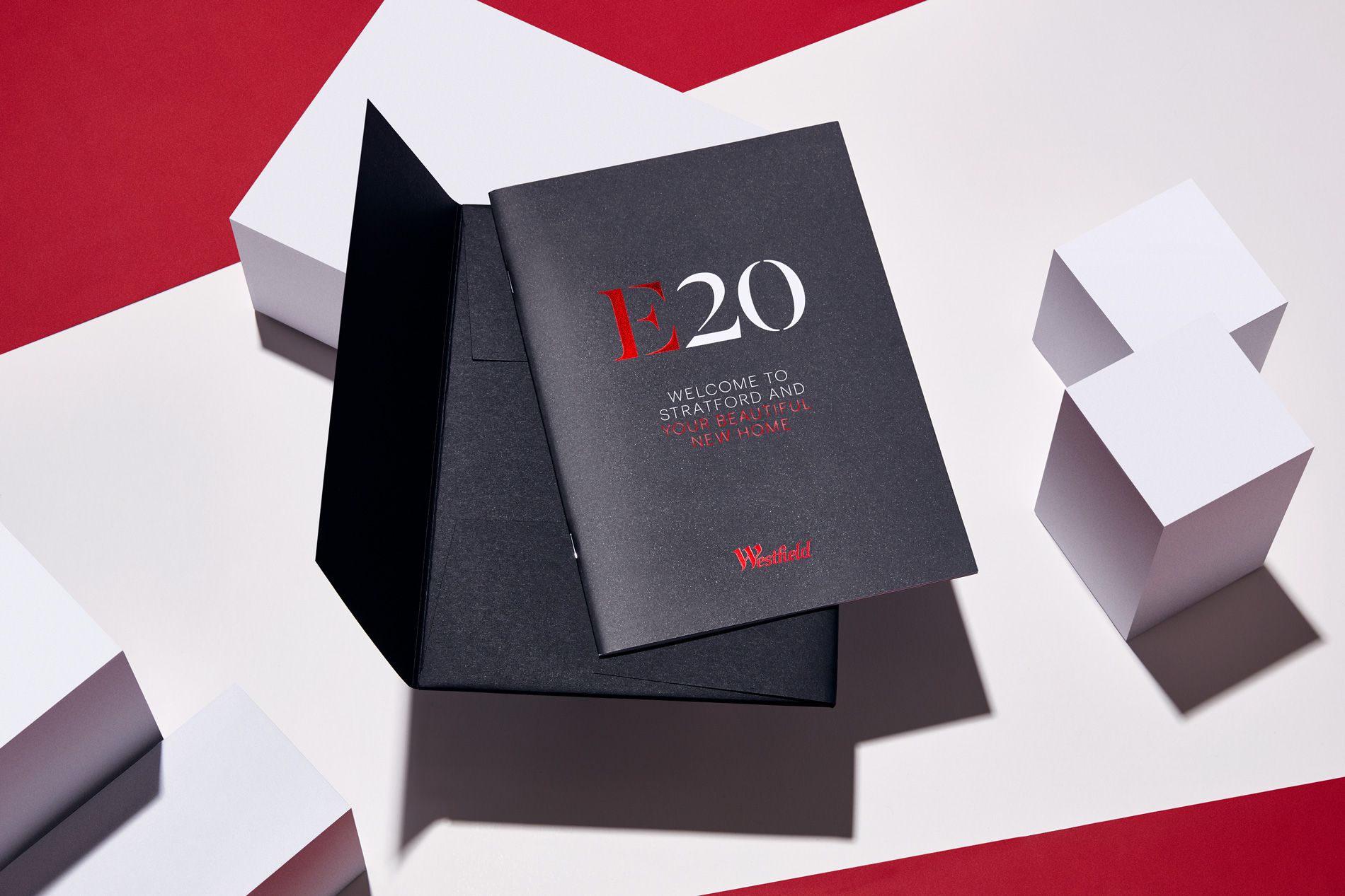
The Cherry Park housing development near Westfield Stratford City needed a brochure to ignite excitement among new residents about their home, the vibrant area, and Westfield’s lifestyle offerings. The brief called for a piece that doubled as a marketing suite showpiece, blending functionality with allure.
A red-foiled cover, echoing Westfield’s signature hue, paired with a design revolving around the ‘E20’ postcode, rooted the brochure in Stratford’s multicultural energy. This coffee-table-worthy book highlighted local perks and Westfield’s role as a community hub, delivering a tangible sense of place. The final product not only welcomed residents but also elevated Westfield’s brand as the heartbeat of the neighborhood.
The Westfield brochure demonstrates a strong identity by anchoring itself in local context while amplifying brand equity. The red-foiled cover ties directly to Westfield’s recognisable palette, ensuring instant association, while the ‘E20’ focus personalises the experience for residents.
Its dual role as a functional guide and a stylish keepsake reflects a brand that values utility and aspiration in equal measure. By positioning Westfield as a lifestyle enhancer, the identity fosters emotional connection—a key driver of brand loyalty. This project illustrates how a strong identity can transform a simple touchpoint into a community cornerstone.
Crafting a brand identity that endures requires a methodical, insight-led process, and at our agency, every project begins with rigorous research and discovery. Analytics uncover user behavior patterns, while stakeholder interviews—often with leadership teams or key clients—reveal the brand’s ambitions and audience expectations, grounding the work in real-world data. From there, strategy development takes center stage, defining a brand’s positioning and shaping its verbal identity to ensure messaging resonates with precision and authenticity.
Strong visual identity creation follows, translating strategy into cohesive design systems that prioritise responsiveness and adaptability across platforms, from digital interfaces to physical materials. Implementation ties it all together, rolling out the identity seamlessly across every touchpoint, ensuring consistency that amplifies impact. This structured, evidence-based approach underpins the success of standout brand identity examples, proving that creativity thrives when paired with strategic rigor.
Brand identity hinges on a strategic foundation, often distilled into five key pillars: Purpose, Positioning, Personality, Perception, and Promise—collectively known as the 5 P's. Purpose defines the brand’s reason for existing, setting the mission that drives every decision, much like the clarity Edelweiss gained in aligning its digital presence with its luxury craftsmanship.
Positioning carves out a unique space in the market, as seen with W11 Construction’s focus on substance over superficial luxury, distinguishing it from competitors. Personality infuses the brand with a distinct tone and character—think of Raiola’s bold, excellence-driven ethos cutting through the football industry. Perception reflects how audiences interpret the identity, shaped by consistent visuals and messaging, while Promise commits to what the brand delivers, a principle Mandarin Oriental’s premium menu design upholds with elegance and functionality. Together, these elements create a cohesive, impactful identity, a formula we leverage to transform brands across industries.
A deep brand identity audit serves as a diagnostic tool, dissecting a brand’s current state to reveal its strengths and shortcomings with precision. This process involves assessing positioning in the market, evaluating the effectiveness of visual elements, and scrutinising consistency across all touchpoints—steps rooted in the same research-driven methodology that shapes successful identities.
The benefits are clear: gaps in perception or execution come to light, strategies sharpen to align with goals, and market presence strengthens as a result of newfound clarity. Projects like Preventicum and Raiola illustrate this impact, where audits uncovered opportunities that fueled transformative rebrands and ambitious growth.
At our agency, luxury expertise in this arena positions the agency as a trusted partner for businesses ready to refine their identity and seize untapped potential.
Far from a mere review, an audit lays the groundwork for evolution, making it an essential step for any serious brand.
From the refined elegance of luxury pianos with Edelweiss to the global ambition of football icons at Raiola, these brand identity examples demonstrate how we convert vision into measurable impact. Each case underscores a truth: a strategic, well-executed identity can redefine a brand’s trajectory across industries as diverse as healthcare, construction, and lifestyle.
The process—rooted in research, strategy, and seamless implementation—delivers results that resonate with audiences and stand the test of time. For those inspired to elevate their own brand, a free brand discovery call with us offers the first step toward unlocking that potential—bookable now. Transformation begins with understanding, and the opportunity to explore a brand’s future awaits.